The Sporting Twenties

“Le Golf.” Sports et divertissements. 1923.Courtesy of the Royal Ontario Museum and Archives.(Photo by author.)

The Roaring Twenties are known as the Jazz Age, the time of jazz, gin, and flappers. But, less obviously, sports also played a big part in the shaping of the decade. The twenties’ love of sports is beautifully conveyed in Sports et divertissements, a rare avant-garde publication that pairs twenty musical compositions by Erik Satie with pochoir illustrations by Charles Martin, hand-coloured by Jules Saude. The Royal Ontario Museum’s Library & Archives recently acquired number 107, out of only 225 produced copies (Sherman). Published by Lucien Vogel in 1923, the magazine takes the reader on various chic excursions, from sailboats to lush picnics in the park, to my two favourites: the tennis court and the golf course. Both of these sports made a significant impact on fashion in the 1920s. “In the years following the First World War, participation in sport and leisure activities – most often tennis, golf, swimming, or sunbathing – became popular and fashionable among women of the upper classes” (Pyper). The women depicted in Sports et divertissements are no exception.

“Le Golf” depicts a woman holding a golf club, with a man with his back turned. The fetching blonde is clearly the star in Martin’s eyes. The pair dressed in their best golf whites, and matching white hats, although her much wider brim sports a pink ribbon, while his features a purple-brown one. She has white wrist length gloves with matching pink bows. The short sleeves of her dress have treble clef musical signs as the embellishment. Most surprising is the shallow v-cut neckline that reveals the shapes of her breasts, and fabric so thin that we can see the outline of a nipple. Golf is sexy; Martin must have thought. This sassy blonde is there to get some birdies, and some male attention while at it. As for Satie, his composition does not exactly correspond to the image. It reads: “The colonel is dressed in “Scotch Tweed” of a violent green. He will be victorious. His ‘caddy’ follows him carrying the ‘bags’. The clouds are astonished. The ‘holes’ are all shaking. The colonel is here! Here it is that ensures the blow: his ‘club’ shatters!” We do not see a man in tweed, and if he were here, he would have probably sweated under the heat of this blissfully sunny sky. However, Satie’s lyrics pay close attention to the clothing, with the emphasis on the tweed suiting and the bags. Fashion was most likely of importance to the composer.

“Le Tennis.” Sports et divertissements. 1923. Courtesy of the Royal Ontario Museum and Archives. (Photo by author.)

In “Le Tennis,” Satie’s lyrics read, “Play? Yes! The good server. As he has beautiful legs! He has a beautiful nose. Service cut. Game!” The corresponding illustration by Martin depicts a man and a woman whose tea service was violently interrupted by a flying tennis ball from a match happening below. The pesky ball made its way to them perhaps right after one uttered Satie’s praise of the male tennis player. He is dressed in white trousers, white short-sleeved v-neck shirt, accessorised with a black belt and what looks like a baseball hat. The stylish player is engaged in a tennis game with two women, a blonde in a pink dress and a brunette in a yellow and white ensemble. They project an image of health and sass. Our two spectators are also a stylish pair: he in a light brown fluffy, (perhaps mohair) sweater, tan trousers and two-tone black and white Oxford spectator shoes; and she in a long-sleeved sailor-inspired frock, accessorised by a thin black choker necklace. These two are members of what Veblen would have categorised as Leisure Class.

Engagement in sporting activities first came into prominence during the Victorian era, when upper-class men and women started to integrate physical activity into their daily lives. “Physical education, like related facets of material culture, became a means by which an increasingly stratified social structure (marked along the lines of class, gender, ethnicity and age) was codified and understood” (Breward, 18-19). Sporting engagement represented a certain social status, or what Veblen referred to as Leisure Class. While Veblen mostly saw sports as a frivolous activity, the focus on one’s body personified religious values of the time. Breward (19) states that “these included the concepts of ‘self-help’ and ‘self-control’, and were summoned up in the popular motto mens sana in corpore sano (‘a healthy mind in a healthy body’).” The phenomenon, whether religion or frivolity drove it, lead to growing commercialisation of sport and sporting attire. By the turn of the century, golf graced the cover of popular women’s publications such as The Ladies’ World (renamed later as The Woman’s World).

“Cover: Vogue.” (Vogue, vol. 58, no. 8, Oct 15, 1921, ProQuest, http://ezproxy.lib.ryerson.ca/login?url=https://search-proquest-com.ezproxy.lib.ryerson.ca/docview/904309290?accountid=13631.)
“Cover: Vogue.” (Vogue, vol. 60, no. 1, Jul 01, 1922, ProQuest, http://ezproxy.lib.ryerson.ca/login?url=https://search-proquest-com.ezproxy.lib.ryerson.ca/docview/879157732?accountid=13631.)

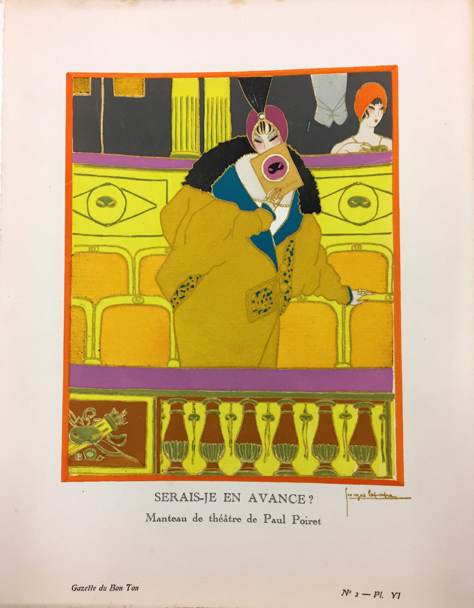
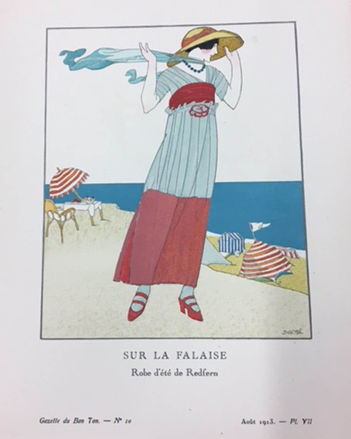
In the 1920s, sportswear had found itself into daytime wardrobes. “Between 1925 and 1928, the difference between sport and day wear seems to be in name only, as styles and fabrics for both spheres converged” (Pyper). Tennis had appeared on the cover of American Vogue in October 1921 and again in July 1922. The 1921 cover has a dreamlike quality, with a woman in a luxuriously ruffled dress floating under a starry sky. She is getting ready to hit a shooting star with her tennis racquet. On the other hand, the 1922 cover depicts two women in the midst of conversation while resting with their racquets in hand. They are dressed in long, narrow-cut frocks, perhaps not ideal for the game of tennis. The woman in white sports a red and white striped overcoat, while the woman in orange has a plush purple scarf. It is difficult to decipher if these clothes are meant for tennis or tea.

“Fashion: The Golf Clubs at “La Bouille” and “Saint Cloud” are Smart Places for Sports and for Sports Costume.” (Vogue, vol. 58, no. 6, Sep 15, 1921, pp. 78, ProQuest, http://ezproxy.lib.ryerson.ca/login?url=https://search-proquest-com.ezproxy.lib.ryerson.ca/docview/904310105?accountid=1361.)

Golf also made its way into Vogue. “Fashion: The Golf Clubs at “La Bouille” and “Saint Cloud” are Smart Places for Sports and for Sports Costume” reads a September 1921 headline. The accompanying editorial illustrations depict willowy men and women congregating around the idyllic golfing grounds, engaged in all kind of profound conversation. No one is actually playing the game, but a golf club was a place to be seen. There is perhaps no better confirmation of that statement than the character of professional golfer Jordan Baker in the iconic 1925 Fitzgerald novel, The Great Gatsby. Jordan is described as a 1920s ideal of beauty and an object of affection for the story’s narrator, Nick Carraway. “I enjoyed looking at her. She was a slender, small-breasted girl, with an erect carriage which she accentuated by throwing her body at the shoulders like a young cadet” (11). Nick enjoys the status associated with the sport. “At first I was flattered to go places with her, because she was a golf champion, and everyone knew her name.” (57) Aside from golfing, Jordan enjoys ample leisure time.

Dancers costumed by Coco Chanel in Le Train Bleu, 1924. (Fashion V Sport, edited by Ligaya Salazar. V&A Publishing. 2008. p. 27.)

Fitzgerald worked on the novel while residing in the chic French Riviera, at the time a playground of the rich and famous, according to Pyper. “Even women who appeared to have no interest in sporting pursuits began to dress in this manner while on holiday, conforming to the new craze for physical culture and the simplified silhouettes that accompanied it” (Pyper). The French used to term sportive to describe the clothing and the women who wore it. One of the designers who embraced this look was Coco Chanel. The designer had famously integrated jersey into her collections, fabric that allowed for simpler construction techniques and the ease of movement. In 1924, Chanel designed costumes for Ballets Russes’s production of Le Train Bleu, an avant-garde ballet featuring a cast in golf and tennis gear, as well as swimwear (Breward, 27).

While it may be a common interest nowadays, active lifestyle was part of the avant-garde echelon. It certainly inspired someone like Satie to pen Sports et divertissements. Completed in 1914, the composer’s twenty piano pieces were shelved for almost a decade due to World War I. When they were published together with Martin’s marvellous illustrations, they were largely ignored by critics and the general public but were revered by fellow musicians and connoisseurs (Davis, 432). Today, however, they are considered some of the composer’s best works. Satie scholar Alan M. Gillmor considered them “purest examples of the composer’s peculiar genius, revealing in abundance the endearing qualities that have become virtually synonymous with his name: wit, parody, irony, fantasy” (2). The publication was in many ways ahead of its time. Sports et divertissements pair fashion, visual art, language, and music before it was common to do so. The publication perfectly captures the decade of excess and optimism, and a time when sport was a stylish affair, perhaps more than any fashion publication possibly could have.

Works Cited

Breward, Christopher. “Pure Gesture: Reflections on the Histories of Sport and Fashion.” Fashion V Sport, edited by Ligaya Salazar. V&A Publishing. 2008. pp. 17-29.

Davis, Mary E. “Modernity à La Mode: Popular Culture and Avant-Gardism in Erik Satie’s Sports Et Divertissements.” Musical Quarterly, vol. 83, no. 3, 1999, pp. 430.

“Fashion: The Golf Clubs at “La Bouille” and “Saint Cloud” are Smart Places for Sports and for Sports Costume.” Vogue, vol. 58, no. 6, Sep 15, 1921, pp. 78, ProQuest, http://ezproxy.lib.ryerson.ca/login?url=https://search-proquest-com.ezproxy.lib.ryerson.ca/docview/904310105?accountid=1361.

Fitzgerald, F. S. The Great Gatsby. Scribner, 1953.

Gillmor, Alan M. “Musico-Poetic Form in Satie’s “Humoristic” Piano Suites (1913-14).”Canadian University Music Review, vol. 8, no. 8, 1987, pp. 1-44.

Pyper, Jaclyn. Style Sportive: Fashion, Sport and Modernity in France, 1923-1930, Apparence(s) [Online], 7 | 2017, Online since 01 June 2017, Connection on 19 March 2018. URL : http://journals.openedition.org/apparences/1361

Satie, Erik. Sports et divertissement. Dessins de Ch. Martin. Gravés sur cuivres et rehaussés de pochoir par Jules Saudé. Paris: Publications Lucien Vogel, [1923]. Print. Royal Ontario Museum Library & Archives. Rare Oversize M25 S27 S7 1923. ROM copy is numbered 159.

Sherman, Ketzia. Sports et divertissements: a unique resource for researchers in design history [Web log post]. 2017, January 27. Retrieved from https://www.rom.on.ca/en/blog/sports-et-divertissements-a-unique-resource-for-researchers-in-design-history

Veblen, Thorstein, 1857-1929. The Theory of the Leisure Class; an Economic Study of Institutions., United States, 1924.


“A woman’s right to shoes” : Shoe worship from the 1920s to today

In 1998, the television network HBO introduced a character that would become paramount to the way American women experienced shoes in the twenty-first century (1) : Carrie Bradshaw. Main character of the iconic show Sex and The City, Carrie Bradshaw is a journalist with a love for (very expensive) designer shoes. Bradshaw’s shoes (mostly Manolo Blahniks) become the fifth character (2) of the show, building narratives and making statements. For example, in season six, Bradshaw is shoe-shamed for buying Manolo Blahnik at $485, to which she responds with her theory on “a woman’s right to shoes.” Bradshaw justifies her love for luxurious footwear by saying it makes life more fun : “The fact is, sometimes it’s hard to walk in a single woman’s shoes, that’s why we need really special ones now and then…to make the walk a little more fun.” Bradshaw’s love for shoes (3) seems to reflect a common Western relationship to footwear. In the United States alone, over $8,000,000,000 is spent annually on high-fashion footwear.(4) Yet, worshipping shoes isn’t a contemporary invention.

The eighth volume of the 1924-1925 French fashion journal Gazette du Bon Ton : Art, Modes & Chronique, published a fashion plate by artist Pierre Mourgue in which the shoe is stealing the spotlight from the woman. Indeed, the woman is turning her back on the viewer, focusing her attention on the shoe, directing the viewer’s gaze directly to the accessory. Not only does the shoe becomes the center of attention because of the woman’s gaze on it, but its position, up in the air, above the model, and in the center, can suggest a certain importance, becoming almost superior to the human. Moreover, the woman is scrutinizing the shoe as if it were a precious gem, reinforcing the superior status of the accessory.

“Le Bel Écrin”, Fashion Plate 63 by Pierre Mourgue, in 1924-1925 n.8 of the Gazette du Bon Ton : Art, Modes & Chronique.

When considering Roland Barthes’ semiological theory, closely examining this fashion plate (and the fashion it represents) may reveal a certain meaning. (5) Indeed, when examining the signifier (the fashion plate) in relation to the signified (the cultural context it was produced in), a meaning could arise (the sign). Because Barthes prioritizes text over visual elements(6), the semiological analysis first needs to consider the information offered through captions. In this case, the caption reveals that the silver and lilac high heeled shoe (which is the exact same colour as the dress) displayed is a model by André Pérugia. Pérugia was an important shoe designer in the first half of the twentieth century.(7) More importantly, the title “Le Bel Écrin” reinforces the position of the shoe as a luxurious possession. Indeed, “écrin” is the French word for a jewellery case box, suggesting that the shoe is a case for the precious foot. This emphasis on the shoe, and therefore on the foot, could be related to the birth of psychoanalysis that happened at the end of the nineteenth century and that was very popular with surrealist artists of the period. Indeed, in various writings, Sigmund Freud emphasized the symbolism of the feet, granting this bodily part with a high status. (8) When considering this caption and the way the woman is admiring the shoe, we can conclude that the journal compares the feet to jewelry and the shoe to a precious jewelry box. Therefore, both the composition and the caption reinforces the shoe’s status as a mythical, worshiped object.

Vogue Paris, January 1925

Indeed, this fashion plate doesn’t depict the shoe as a simple tool to protect the feet when walking, but as a luxurious product, protecting the jewelry-like feet. This depiction can be understood in regards to the context and fashion trends of the period. In the 1920s, shoes and stockings became the focus of attention in fashion trends.(9) Indeed, the decade’s fashion evolved around higher hemlines, waistless dresses and short hair. For the first time in centuries, women were showing their legs in public and, as a result, their shoes were completely visible.(10) Marie-Agnès Parmentier argues that the flappers’ fashion “further entrenched the association between heels and seduction.”(11) Indeed, flappers’ garments were very controversial (12) and heels had for centuries been associated with sexuality. For example, Valérie Laforge suggests that in Ancient Rome, prostitutes were recognized from other women by the height of their heels.(13) Similarly, in the middle of the nineteenth century, “high heels became infused with erotic significance” (14) as the concepts of courtesans and sexuality became important topics in Europe. Edouard Manet’s Olympia (1863) is a good example of how high heeled shoes “were emerging as a standard accessory to the commodified body.” (15) Similarly, in the 1920s, flappers suggested their sexual availability through their high heels, short dresses and makeup. Elizabeth Semmelhack argues that 1920s women suggestively displayed their legs in response to the lack of marriageable men. (16)  Indeed, both the First World War and the Spanish flu had greatly decimated the population and it became difficult to find husbands. (17) Considering the context, it therefore makes sense to position the shoe as the focal point of this illustration, since footwear was an important element of women’s fashion. 

However, high heels were not just associated with flappers’ sexuality. (18) Indeed, high heels, and shoes in general, hold various meanings, and have done so for centuries. (19) Through history, the shoes have often taken various mythical positions. For example, shoes were found in tombs from Roman Empire, suggesting a belief that footwear held magical power. Indeed, “they were there to ensure that the deceased walked in splendour in the otherworld.” (20) Similarly, in Ancient Egypt, platform shoes were associated with wealth and power. (21)

The popularity of the high heel would even have arisen from the fact that they made the feet look smaller by hiding parts of them under the skirts, leaving only the toes visible. (22) Indeed, small feet were symbols of natural nobility, a symbol that can be read in the late seventeenth century edition of Charles Perrault’s Cinderella. (23) The Cinderella fairytale also suggests that shoes hold a mysterious transformative power, which can change a woman’s life. This narrative can easily be related to the context of the 1920s. Indeed, as mentioned previously, some scholars argue that the flappers used shoes as a way to attract men…the same way Cinderella finds her prince through the glass slipper. As a result, Cinderella’s narrative could be easily related to this fashion plate, since the elevated position of the shoe suggests a certain power.  This power could have been linked to the fact that showing elegant high heels for the flappers was a way to openly show their open sexuality as a way find a husband. Moreover, Cinderella elevates her social position through her shoes (24), the same way wearing beautiful shoes in 1920s could help to elevate a woman through marriage. Indeed, Helen Persson argues that “our choice in shoes can help project a fully realized image of who we want to be.” (25) Charles Perreault published the first European version of Cinderella in France in 1697, we can therefore consider that the artist was aware of this transformative association with shoes.

Cinderella Disney movie, 1950.

Moreover, when the Gazette du Bon Ton published this fashion plate in 1925, the magazine would have been sponsored by the most important couturiers in Paris, such as Worth, Paquin and Poiret, and was geared towards an elite readership. (26) Indeed, the high end fashion journal used the technique of the pochoir, a “laborious and expensive process” (27) and high quality paper and print, which made it quite expensive. According to Linda Kathryn Pilgrim, artists were commissioned to draw couture pieces, but they didn’t just copy the garments : they created narratives. In this case, the shoe’s position seem make reference to the mythical and transformative power of footwear and especially of high heels. Because the magazine was commissioned by haute couture designers, we could suggest that this fashion plate was composed specifically as a way to justify the prices and quality of haute couture pieces by comparing the shoe to a jewelry. Indeed, we can assume that designers financing the magazine would have encouraged placing haute couture in a mythical, luxurious position. It was a common practice for those couturiers to market their creations as works of art as a way to encourage purchases and to reinforce their value and authenticity. (28) Considering that the shoe designer Perugia worked privately with Poiret (29), this fashion plate was used as a marketing tool. 

However, because whenever the signifier or the signified change, the sign is automatically modified too, (30) this analysis can’t completely establish what this illustration meant in a 1920s context. Indeed, we can try to understand how this fashion plate translated into a sign in its context of creation, yet the signified can’t be the same because my cultural background won’t ever be the same as a 1924-1925 elite woman who was the target audience for this illustration. As a result, because Barthes’ theory is defined and applied through subjectivity, the previous analysis can’t be completely objective. Yet, interestingly, the mythical position of the shoe is still relevant in a twenty-first century Western context. Indeed, as mentioned in the introduction, shoes still hold a very important mythical position in our society. Why do shoes specifically play such important roles? Considering how shoes “can dictate the wearer moves” (31) by affecting the posture and the way one walks, is it possible to study shoes only visually, without considering the wearer’s embodied experience? Indeed, Persson argues that shoes are more difficult to sell at auction houses such as Christie’s than selling haute couture garments because they are so closely connected with the bodies that wore them. (32) Considering that shoes aren’t investment pieces like designers’ handbags are, what makes people so attracted to them? Persson argues that “we simply love shoes,” (33) do you agree?

_________________________________________________________________________

End Notes

(1)“Of course, the desire for shoes, and for certain maker’s shoes, is not new, but Carrie Bradshaw ensured that these brands became a part of a cultural vernacular. Owning a pair of Manolos became aspirational: you would not just acquire a pair of expensive shoes, but you would live the dream of a glamorous, extravagant lifestyle, like that of pampered celebrities.” Helen Persson, “Objects of Desire : The Cult of Shoes,” in Shoes : Pleasure and Pain, ed. Helen Persson (London: V&A Publishing, 2015), 21.

(2) Kim Akass and Janet McCabe, Reading Sex and the City, (London: I.B. Tauris, 2004), 137.

(3) Akass and McCabe,Reading Sex and the City, 166.

(4)Lewis, David M. G. Lewis et al., “Why Women Wear High Heels: Evolution, Lumbar Curvature, and Attractiveness,” Frontiers in Psychology 8, (2017) : 1

(5) “Semiology, therefore, propounds the very persuasive idea that everything is a text that can be decoded as a sign and, moreover, that the signified object is not like a single word, but rather a sentence in its own right.”  Paul Jobling, “Roland Barthes : Semiology and the Rhetorical Codes of Fashion,” in Thinking Through Fashion : A Guide to Key Theorists, ed. Agnès Rocamora and Anneke Smelik, (London : I.B. Tauris, 2016), 136.

(6) Jobling, “Roland Barthes,” 138.

(7) Klaus Carl and Marie-Josephe Bossan, Shoes, (New York : Parkstone Press International, 2011), 198-200.

(8) Joseph Fernando, “Foot Symbolism,” Canadian Journal of Psychoanalysis 6, no. 2 (1998): 309-320.

(9) Christina Probert, Shoes in Vogue since 1910, (New York : Abreville Press, 1981), 18.

(10) “During the 1920s, the flapper-style dress, which was based on a loose tunic or tubular shift, dared to reveal more of the female leg than ever before in modern Western history.” Myra Walker,”Miniskirt,” in The Berg Companion to Fashion, ed. Valerie Steele, (Oxford: Bloomsbury Academic, 2010), 513.

(11) Marie-Agnès Parmentier, “High Heels,” Consumption Markets & Culture 19, no. 6 (2016): 514.

(12) Sauro “Flappers,” 339.

(13) Valérie Laforge, Talons et tentations (Quebec : Fides, 2001), 58-59.

(14) Elizabeth Semmelhack, “A Delicate Balance : Women, Power and High Heels,” in Shoes : A History from Sandals to Sneakers, eds. Giorgio Riello and Peter McNeil, (Oxford : Berg, 2006), 230.

(15) Semmelhack, “A Delicate Balance,” 230.

(16) Elizabeth Semmelhack, Heights of Fashion: A History of the Elevated Shoe, (Pittsburgh : Periscope Publishing, 2008), 38.

(17) Semmelhack, Heights of Fashion, 38.

(18) Clare Sauro “Flappers,” in The Berg Companion to Fashion, ed. Valerie Steele, 339-341, (Oxford: Bloomsbury Academic, 2010), 339.

(19) Semmelhack, “A Delicate Balance,” 224.

(20) Colin McDowell, Shoes : Fashion and Fantasy, (New York : Rizzoli, 1989), 60.

(21) Laforge, Talons et tentations, 52.

(22) Semmelhack, “A Delicate Balance,” 227.

(23) Semmelhack, “A Delicate Balance,” 227.

(24) McDowell, Shoes : Fashion and Fantasy, 61.

(25) Persson, “Objects of Desire : The Cult of Shoes,” 17.

(26) Linda Kathryn Pilgrim, ““La Gazette Du Bon Ton: Arts, Modes, and Frivolités”: An Analysis of Fashion and Modernity through the Lens of a French Journal De Luxe” (master’s Thesis, University of Southern California, 1999), 5.

(27) Pilgrim, “”La Gazette Du Bon Ton,” 1.

(28) Nancy J. Troy, “Poiret”s Modernism and the Logic of Fashion,” in The Fashion History Reader : Global Perspectives, eds. Giorgio Riello and Peter McNeil (New York : Routledge, 2010), 455.

(29) Carl and Bossan, Shoes, 198.

(30) “These two entities are indivisible in the sign itself. Thus, if the signifier is changed, then so too is the signified and, by implication, the sign.” Jobling, “Roland Barthes,” 135.

(31) Persson, “Objects of Desire : The Cult of Shoes,” 17.

(32) “Persson, “Objects of Desire : The Cult of Shoes,” 21.

(33) Persson, “Objects of Desire : The Cult of Shoes,” 21.

_________________________________________________________________________

Bibliography

Akass, Kim and Janet McCabe. Reading Sex and the City. London: I.B. Tauris, 2004.

Carl, Klaus and Marie-Josephe Bossan. Shoes. New York : Parkstone Press International, 2011.

Esman, Aaron H. “Psychoanalysis and Surrealism: André Breton and Sigmund Freud.” Journal of the American Psychoanalytic Association 59, no. 1 (2011): 173-181.

Fernando, Joseph. “Foot Symbolism.” Canadian Journal of Psychoanalysis 6, no. 2 (1998): 309-320.

Jobling, Paul. “Roland Barthes : Semiology and the Rhetorical Codes of Fashion.” In Thinking Through Fashion : A Guide to Key Theorists, edited by Agnès Rocamora and Anneke Smelik, 132-148. London : I.B. Tauris, 2016.

Laforge, Valérie. Talons et tentations. Quebec : Fides, 2001.

Lewis, David M. G., Eric M. Russell, Laith Al-Shawaf, Vivian Ta, Zeynep Senveli, William Ickes and David M. Buss. “Why Women Wear High Heels: Evolution, Lumbar Curvature, and Attractiveness.” Frontiers in Psychology 8, (2017) : 1-7.

McDowell, Colin. Shoes : Fashion and Fantasy. New York : Rizzoli, 1989.

Oria, Beatriz. Talking Dirty on Sex and the City: Romance, Intimacy, Friendship. Lanham : Rowman & Littlefield, 2014.

Parmentier, Marie-Agnès. “High Heels.” Consumption Markets & Culture 19, no. 6 (2016): 511-519.

Persson, Helen. “Objects of Desire : The Cult of Shoes.” In Shoes : Pleasure and Pain, edited by Helen Persson, 10-21. London: V&A Publishing, 2015.

Pilgrim, Linda Kathryn. ““La Gazette Du Bon Ton: Arts, Modes, and Frivolités”: An Analysis of Fashion and Modernity through the Lens of a French Journal De Luxe.” Master’s Thesis, University of Southern California, 1999. ProQuest (1409654)

Probert, Christina. Shoes in Vogue since 1910. New York : Abreville Press, 1981.

Sauro, Clare. “Flappers.” In The Berg Companion to Fashion, edited by Valerie Steele, 339-341. Oxford: Bloomsbury Academic, 2010. https://www-bloomsburyfashioncentral-com.ezproxy.lib.ryerson.ca/products/berg-fashion-library/encyclopedia/the-berg-companion-to-fashion/flappers.

Semmelhack, Elizabeth. “A Delicate Balance : Women, Power and High Heels.” In Shoes : A History from Sandals to Sneakers, edited by Giorgio Riello and Peter McNeil, 224-245. Oxford : Berg, 2006.

Semmelhack, Elizabeth. Heights of Fashion: A History of the Elevated Shoe. Pittsburgh : Periscope Publishing, 2008.

Troy, Nancy J. “Poiret”s Modernism and the Logic of Fashion.” In The Fashion History Reader : Global Perspectives, edited by Giorgio Riello and Peter McNeil, 455-465. New York : Routledge, 2010.

Walker, Myra. “Miniskirt.” In The Berg Companion to Fashion, edited by Valerie Steele, 513-514. Oxford: Bloomsbury Academic, 2010. https://www-bloomsburyfashioncentral-com.ezproxy.lib.ryerson.ca/products/berg-fashion-library/encyclopedia/the-berg-companion-to-fashion/miniskirt.

“Better legs…through chemistry”: An Advertisement Analysis

“Your legs are lovelier in nylons.” – DuPont advertisement in Harper’s Bazaar, April 1957, p. 10

Upon carefully flipping through magazines from the last century at the ROM library (which I had not known of until recently) I came across an interesting advertisement. Within the first few pages of a Harper’s Bazaar, April 1957 copy (v. 90, no. 2957), was a colour printed advertisement for DuPont nylon (Fig. 1). It was interesting to me because this advertisement features a familiar material common in today’s fashion. I was intrigued to learn more about it, so I did some research.

Figure 1. DuPont nylon advertisement, Harper’s Bazaar April 1957, p. 10. Courtesy of the Royal Ontario Museum Library and Archives. Photo by: Emilie Chan


Harper’s Bazaar

Since its inception in 1867, Harper’s Bazaar soon became America’s leading fashion and mass circulated magazine in the 1950s (“Catalina Announces”). The publication was sold in America, Canada, and London (Fig. 2b). The first half of each magazine within the decade consisted of advertisements, followed by “fiction and features” (Fig. 2b). Selling at 60 cents per copy in the 1950s, this American publication targeted middle and upper class women (Covert 27). This particular copy (Fig. 2a) is part of the publication’s 90th anniversary (Fig. 2b).

Figure 2a. Front cover, Harper’s Bazaar April 1957. Courtesy of the Royal Ontario Museum Library and Archives. Photo by: Emilie Chan
Figure 2b. Table of contents, Harper’s Bazaar April 1957. Courtesy of the Royal Ontario Museum Library and Archives. Photo by: Emilie Chan


The United States in the 1950s

Figure 3. Children’s Book from 1955: the Happy Family. Source: http://envisioning113.rssing.com/chan-19524258/all_p1.html

At this time, many people were enjoying the post-war boom. The economy allowed for a dramatic expansion of the middle class, thus allowing more people the ability to consume at higher rates (“The 1950s”). Many young, heterosexual, American families moved to the suburbs (“The 1950s”). Women within the expanded middle class were urged to leave the workforce to embrace motherhood and the role of a wife (Marias 138), depicted in Figure 3. Although this concept of a women’s role was not new to history, some women at home were dissatisfied—they yearned for life outside of the home (Marias 139). Television dramatically rose in popularity and accessibility—production in 1948 at 250,000 units leapt to 40 million units by 1955 (Marias 181). Although fewer than 6 percent of units produced were not in use, one in five inhabitants had access to a television (Marias 181). The power of this technology spread images and reinforced ideologies of the “American way of life” to the masses (186).

While many women were enjoying freedom in fashion, the ideal beautiful woman was Caucasian, slender, and graceful (Marias 152). Although inequality in race was increasingly publicly scrutinized, the “ideal” remained predominately white (“The 1950s”). Women were often more interested in dressing to attract and appeal to men, than to impress other women (Marias 154). There were three common ways to shop for clothes—walking down store-lined streets, going to a shopping centre, or browsing a catalogue and purchasing through mail order (Marias 67). An advertisement like this (Fig. 1) aims to raise awareness and evoke a desire for DuPont branded nylon products.


DuPont and Nylon

Figure 4. Parachute inspection at DuPont facility, 1940. Source: https: //www.pinterest.co.uk/ pin /109071622200294343/

Developed by American company DuPont in the 1930s, nylon soon became commercially produced by 1939 (“Our Company”). During World War II, nylon was used in parachutes and chords (“Science of Plastics”) (Fig. 4). Post war, the material was applied to various consumer products, famously women’s stockings (“Science of Plastics”). Trickling into the 1940s, there was growing unease about synthetic fibres as DuPont advertised nylon as a magical material that would never run or break (Meikle 127). To combat this fear, advertising strategy drastically shifted focus onto the aesthetic aspects of nylon instead of its functional qualities (Meikle 128). Nylon became a “textile prodigy” that could produce “lovely legs” (Handley 40). By 1946, nylon was accepted by the mass market, accelerated through female consumers, and a new substitute for natural materials such as silk (Handley 49). However, by the 1950s, DuPont began facing slower growth in sales (“Our Company”). Competition within the generic textile fiber industry was extremely high, and the abundance of fabric choices were steadily increasing (Handley 75). Branding became key to product differentiation (Handley 75).


Advertisement Analysis

The Image

Figure 5. Main image on advertisement, Harper’s Bazaar April 1957, p. 10. Courtesy of the Royal Ontario Museum Library and Archives. Photo by: Emilie Chan

It is clear that this advertisement aims to position DuPont branded nylon as a desirable material for women’s stockings (since DuPont only manufactured textile materials) (Fig. 7). Portrayed is a presumably middle-aged man dressed in a suit, and a women in a colour -coordinated outfit precariously walking down a flight of stairs. These two characters depict the social ideal of the 1950s— this advertisement suggests that they live in a house, are likely in a lasting heterosexual marriage, and fall within the middle class.

Pierre Bourdieu, a French sociologist, suggests that there are three forms of capital that determines an individual’s position within the field of fashion—economic, social, and cultural (Bourdieu 243). The two characters seem to possess some economic capital, belonging to the middle class, based on the house they are placed in and the image they depict. The man casually talking on the phone shows social capital to a certain degree. To further the woman’s social capital, her legs are modestly caved inwards, suggesting subtlety and etiquette, yet still able to appeal to her male counterpart.  Evidently, this image depicts the ideal woman the Bazaar’s female readership desired.

Within cultural capital, there are three states—embodied, objectified, and institutionalized (Bourdieu 243). The objectified state is represented by material objects, cultural goods that can be acquired with economic capital to gain social power and distinction (Bourdieu 243). Here, the ideal woman is walking down the stairs in nylon stockings, successfully garnering the whimsical glance of her male counterpart. This demonstrates the cultural capital DuPont nylon stockings, a simple branded material, can offer women. Women are also offered an opportunity to gain cultural capital in an embodied state, successfully appealing to their male counterparts through self-improvement via branded clothing in a relatively modest, subtle way.

Figure 6. Playboy magazine cover, June 1956. Source: https://www.thepaperframer.com/Playboy56.php

In direct contrast, Playboy, an entertainment magazine for men first published in 1953, was increasing in popularity. It had expanded its popular Playmate double page spread to a triple page centrefold in 1956 (“Our History”). With the help of nylons, women were offered a product that could help them compete against Playboy magazines and models, with the help of fashion. Here, fashion and way of dressing is connected to moral values, a characteristic of the modern stage of sartorial representation suggested by Efrat Tseȅlon (219) inspired by (sociologist by training) Jean Baudrillard’s (Tseȅlon 215) signification analysis (Baudrillard 88).

Tseȅlon suggests that there are three stages of sartorial representation—pre-modern, modern, and post-modern (Tseȅlon 218). Within the modern stage, technological developments increase production efficiency, thereby lowering production costs and widening the availability of clothing previously exclusively accessible to the upper class (Tseȅlon 219). Dress no longer represents status because of the homogeneity of style, but rather, is reflected an individual’s gender and other temporal variables such as mood, time of day, season, or occasion (Tseȅlon 220). Revealed in the text within the 1957 advertisement, nylon stockings are framed as the ideal product for any of the aforementioned variables. It states that “there’s a just-perfect stocking for every occasion from a walk in the country to a night out of town” (Fig. 7). This reinforces this advertisement’s place within the modern stage. Nylon stockings were available to a wide customer base and could be used to reflect any occasion or personal characteristic. The advertisement also reflects Baudrillard’s idea of consumption as a characteristic of desire for the maintenance of an individual’s own image, that can only be fulfilled by objects, in this case, nylon as fashion (Tseȅlon 216).


The Text

Figure 7. Main text within advertisement, Harper’s Bazaar April 1957, p. 10. Courtesy of the Royal Ontario Museum Library and Archives. Photo by: Emilie Chan

Although this advertisement is largely made up of a single image, the text plays an equally important role. According to Roland Barthes, well known for his semiotic and linguistics studies (“Roland Barthes”), suggests that “written clothing” in the form of captions can further inform the audience (The Fashion System 13). Upon examining the image, it is clear that the woman is receiving admiration from her male counterpart. This is supplemented by the text: “You’re the object of admiration in today’s glamourous nylon. How beautifully they reveal your natural perfection. How happily they conceal any little imperfection” (Fig. 7). Women viewing this advertisement now discover that the ideal woman in the image has simply concealed her “flaws” to create the ideal, perfect, and beautiful image. Barthes argues that advertising sells a myth, a fake idea, of the fairy tale consumers can potentially experience (The Elements of Semiology 178) through the purchase of nylon products . In this case, DuPont is selling the “myth” that women can enhance their natural qualities, while covering their imperfections by wearing specifically DuPont nylons to successfully appeal to their male counterparts. The large caption stating: “Your legs look lovelier in nylons” further communicates the ability nylons possess to enhance a woman’s image and attractiveness, supplementing the picture above it.

Figure 8. DuPont logo and slogan, Harper’s Bazaar April 1957, p. 10. Courtesy of the Royal Ontario Museum Library and Archives. Photo by: Emilie Chan

DuPont’s slogan, “Better things for better living…through chemistry” (Fig. 8) adds to the cultural capital a woman can gain from buying DuPont nylons. They claim that purchasing DuPont nylon stockings will give women admiration. From understanding the context of the advertisement and thereby already displaying a degree of cultural capital, women are offered insight to gain additional cultural capital through purchasing DuPont nylons, an exciting high-tech material from the company that arguably stated the nylon revolution. This exemplifies Entwistle and Rocamora’s notion that cultural capital can be displayed through appropriate, “in-the-know” outfits (Tseȅlon 240).

When I first saw this advertisement, I did not think much of it. As usual, when examining artifacts from the past, I did not realize how much more I could understand through learning the economic, technological, and social context behind the advertisement.


Today, there is evidently greater focus on visual images in paper advertising compared to the advertisements of the 1950s. Knowing that text can effectively enhance and supplement understanding and meanings behind an image, do you think this shift in paper advertising is positive?


__________________________________________________________________________________________

References

Barthes, Roland, The Elements of Semiology. Translated by Annette Lavers and Colin Smith, Hill and Wang, 1973.

—- The Fashion System. Translated by Matthew Ward and Richard Howard, University of California Press, 1990.

Baudrillard, Jean. Symbolic Exchange and Death. Sage Publications, 1993.

Bourdieu, Pierre. “The Forms of Capital.” Handbook of Theory and Research for the Sociology of Education, edited by John G. Richardson, Greenwood Publishing Group Inc., 1986, pp. 241-258.

“Catalina Announces Biggest Advertising Campaign in its Entire Thirty-Six-Year History!” Women’s Wear Daily, vol. 68, no. 5, Jan 07, 1944, pp. 31, ProQuest, https://search-proquest-com.ezproxy.lib.ryerson.ca/docview/1653877427?pq-origsite=summon.

Covert, Tawnya J. Adkins. Manipulating Images: World War II Mobilization of Women through Magazine Advertising. Lexington Books, 2011.

Handley, Susannah. Nylon: The Story of a Fashion Revolution:  A Celebration of Design from Art Silk to Nylon and Thinking Fibres. Johns Hopkins University Press, 1999.

Marias, Julián. America in the Fifties and Sixties: Julián Marias on the United States. Pennsylvania State University Press, 1972.

Meikle, Jeffrey L. American Plastic: A Cultural History. Rutgers University of Press, 1995.

“Our Company: History.” DuPont. http://www.dupont.com/corporate-functions/our-company/dupont-history.html. Accessed  March 28 2018.

“Our History.” Playboy Enterprises. http://www.playboyenterprises.com/about/history/. Accessed  March 28 2018.

“Roland Barthes.” Encyclopedia Britannica. https://www.britannica.com/biography/Roland-Gerard-Barthes. Accessed  March 28 2018.

“Science of Plastics.” Chemical Heritage Foundation. https://www.sciencehistory.org/science-of-plastics. Accessed  March 28 2018.

“The 1950s.” History.com. https://www.history.com/topics/1950s. Accessed  March 28 2018.

Tseȅlon, Efrat. “Jean Baudrillard: Post-modern Fashion as the End of Meaning.” Thinking through Fashion: A Guide to Key Theorists, edited by Agnès Rocamora and Anneke Smelik, 2016, pp. 215-232.


Agatha: The Written Diary of a Victorian Maid

This blog post is a creative reflection on Plate 17 from the 1890-1891 “The Ladies Tailor,” (Williamson) which was reviewed at the Royal Ontario Museum, call number: RB P.S. La 120 v. 6-7). The author would like to thank the team at the ROM libraries for their help and guidance. This blog post aims to explore Victorian domestic service and the social structure of working for a middle class family within the context of creating this jacket pictured in “The Ladies Tailor,” (Williamson, 40). This blog entry also references and adapts story lines from “Maud: The Illustrated Diary of a Victorian Woman,” (Fraser and Berkeley, 1987) a published diary of a middle-class woman who kept a diary of her day-to-day experiences along with charming illustrations, some of which are featured below.

Victorian maid, n.d. https://www.pinterest.ca/pin/619174648739855477/

May 14, 1891

Well, hello there! I’m not quite sure how I feel about keeping a diary, but my mistress seems to enjoy it, she certainly writes in hers regularly (Fraser and Berkeley), and at this particular moment I’m fit to burst with the story of my day and no one to tell it to. At this particular moment I can’t recall a day with so many hiccups as this one!

To be perfectly honest – I feel a bit rude jumping into my story without introducing myself properly, so I’ll try to be as brief as possible, but as my Gran says – I’m a bit chatty. My name is Agatha Jones, born and raised in Edinburgh before starting in service at 12 (Higgs, 201), and I’m old enough to have lost any girlish giddiness. I’m a maid-of-all-work for Miss Maud – oh, my heavens – Major-General James Berkeley and Mrs. James Berkeley – although she says I can call her Mrs. Maud, as she’s not one for formalities. You see, I’m not used to referring to my mistress as anything other than Miss Maud, as I originally worked for her parents on the Isle of Wight (Fraser and Berkeley, 6) when Maud was a spinster. I prefer working in Mrs. Maud’s household much better, not that it was all that bad in Wight – just terribly boring looking after her somehow always sickly and decidedly elderly parents and preparing dull food (Fraser and Berkeley, 51), which is perhaps why I admire Mrs. Maud so much, she’s awfully busy and athletic, particularly in regards to ice-skating (Fraser and Berkeley, 10), and always going out and about with her friends (with such silly nicknames! ‘Rozie,’ ‘Steakie,’ ‘Tykie,’ and who could forget ‘Noggie,’ ‘Hoggie,’ ‘Shoggie,’ and ‘Toddie!’ (Fraser and Berkeley, 8) — I never knew if she was referring to a man or a woman with nicknames like those). Mrs. Maud would come home and regale me with her adventures. And quite the adventures they would be – the disaster of a billiards cue falling over mid-game, or losing a sash mid-dance (Fraser and Berkeley, 10). However, she’s been married almost 8 months now to Major-General Berkeley, and is step-mother to his children – his two youngest daughters, Miss Lily and Miss Trixie, are teenagers and living at home (luckily all the women get along right as rain) (Fraser and Berkeley, 12). Mrs. Maud is actually a distant cousin of mine (Higgs, 206). As I said, Mrs. Maud isn’t one for formalities and is adjusting quite well to married life and step-motherhood, but apparently someone from her circle thinks she should be more conventional, which is what led to Mrs. Beeton showing up at the doorstep. Oh! How Mrs. Maud has had a time pretending to run the house like a military officer (Beeton, 3), and chuckling when she uses slang and then exclaiming that she is the ‘model of morality’ (Beeton, 9). Maud says that referring to Beeton’s book as a code of conduct for running a household is the same as walking around dressed as if in a fashion-plate (Higgs, 203).

Please take note of my mistress’ jacket (in white!). Fraser and Berkeley, 22.

My daily duties are many, but generally each day goes as so: both preceding and following the family throughout the house so that it can be prepped by myself, made a mess of by them, and tidied up once they’ve moved on to another room I’ve just prepared. I clean the kitchen before it needs using and I then use it and help prepare the meal, the dining room before it is dined in, their bedrooms while they’re eating, the front hall before they leave, and use their absence as a chance to clean anything and everything (Beeton, p89). But I’m a smart-worker, and plan out which days I should clean which things and determine how often they need to be cleaned, and review the family’s social calendar to determine if extraordinary items need preparation or mending (Beeton, 92). I do what I can when I can at all times, as being a maid-of-all-work implies. I’ve heard of some in service coming up with all sorts of fancy titles for themselves (Reid, 133), but they’re still in service, and the butler and the housekeeper are always at the top. I don’t generally like mean sketches, but the ones in Punch magazine on this job title fluffing up did test me in stifling my laughter at my friends’ expense (Reid, 133). But I most certainly have fair employers, who are not so high and mighty as to turn their noses up at a bit of work – Mrs. Maud and her step-daughters help daily with the bed making (Beeton, 90). This is most refreshing as my employers have capital in every way: economically respectable, culturally engaged, and social connections abound with Major-General Berkeley’s military service (Bourdieu, 243).

Miss Trixie and Mrs. Berkeley on a stroll last autumn (Mrs. Berkeley must really love that style of jacket!). Fraser and Berkeley, 83.

See now look what I’ve gone and done – chatted away for pages! I’m sure you feel more than properly introduced – perhaps feeling overwhelmed! So, I’ll get back to why I wanted to write today – making Mrs. Maud’s new jacket (even though, if I’m to be bold, she has a perfectly good jacket that looks quite similar already to this one, but I suppose that is more of a skating jacket…). Plate 17 in this month’s The Ladies Tailor, in particular the bottom left jacket, was my goal (Williamson, 41). Now, I don’t know about you, but I find the tone of Ladies Tailor quite annoying – always asserting again and again how you can make variations to the pattern and style (Williamson, 34). Well, of course I can! And so can everyone else making something for someone else, whose individualistic variation requests are more important than the instructions – my Gran taught me that as well as to be the (quite skilled, if I’m honest) seamstress that I am. But, as I found out today, this tone can be even more annoying when one’s requester wants you to make the exact article as pictured, and the accompanying text goes on and on about varying away from what is pictured! Hm. I can tell that I’m still quite flustered from this experience! Why you may ask? Well, I will tell you why – because my afternoon downtime today was to be used to work on this jacket, but this work kept getting interrupted by the silliest things!

Williamson, 40. Image taken by author at the Royal Ontario Museum.

The first incident was with Miss Lily, one of the daughters, having – quite frankly – a very humourous battle with the shower contraption the Major-General installed (Fraser and Berkeley, 126). This invention is meant to provide the bather with a ‘shower-bath,’ but when Miss Lily made an attempt at taking one, the hose took on a life of its own – going every which way all over the bathroom like an elephant’s trunk (Fraser and Berkeley, 126)! I ran to upon hearing the commotion and screaming, and found the room, Miss Lily – and eventually myself – soaked through (Fraser and Berkeley, 126)! After we tamed the beast, and Miss Lily swore that till the end of her days she would bathe as she always had (Fraser and Berkeley, 126), I went upstairs to dry off and get back to my task.

A wretched beast! Fraser and Berkeley, 124.

Just as my head was filling with ‘austrian knots,’ ‘crow’s toes,’ and ‘gauntlet cuffs’ (Williamson, 34), another disaster struck! While Mrs. Maud was out for a picnic with her lady friends, the pitcher of lemonade fell over (Fraser and Berkeley, 10) and Mrs. Maud had come running back to replace the lost refreshment. She asked me to make lemonade as quickly as possible, and thank heavens I had made an extra pitcher that morning – with a recipe I find I always gravitate towards:

  • 1 ½ oz. citric acid
  • 1 ½ lb loaf sugar
  • 40 drops of perfectly good essence of lemon
  • 1 pint of boiling water
  • 2 lemons

And, as the recipe – taken from a Keating’s powder advertisement no less – says “Pour the Essence of Lemon on the sugar and acid in a jug. Add the boiling water, then cover till cold’ when required for use, put 1 part to 4 or 5 parts of water and add the juice of 2 lemons” (Loeb, 6).

After bidding my grateful mistress off, I went to check on the chocolate cake prepared for that evening’s dessert. Somehow or other I got some chocolate on my hands, which made its way to my fresh apron! The sight of that perfectly brown smudge on my crisp white apron exhausted me, and as I washed out the stain I felt as though I never detested an advertisement more than the one for Sinclair’s Soap, which makes domestic work looks like a heavenly idyll, instead of the constant mishaps interrupting the routine of labourious tasks (Loeb, 16-7)!

My employers at their leisure! Fraser and Berkeley, 18.

My word! I went back to my workstation, and was able to get some work done without interruption, and no, I did not take the author’s advice to indulge in the myriad of variations I could produce. My Gran always said that a well-tailored piece of clothing upheld one’s respectability (Sayer, 118), and I think my mistress would agree that this upholding is more useful than creative expression (Sayer, 112). Besides, Mrs. Maud would rather her clothing signal that she is as she appears to be – a good wife, step-mother, and at the helm of a happy, well-kept, and respectable home than her individual personality – which shows through quickly enough by her actions. Wouldn’t you agree that it’s more important to have a garment of sound structure, than one that expresses individuality?

Williamson, 34. Image taken by author at the Royal Ontario Museum.

Perhaps my day was all the more dramatic in my head than written down on paper, but there you are. While Mrs. Beeton would recommend that I do needlework at my end-of-day rest (Beeton, 93), I’ve had quite enough of that, thank you very much. I’m going to sit in my chair, rest my eyes, and have a “momentary affair” with the world of leisure – a cup of cocoa (Loeb, 173).

Works Cited

Bourdieu, Pierre. Handbook of Theory and Research for the Sociology of Education. Greenwood, 1986.

Beeton, Isabella. How to Manage House and Servants and to Make the Most of your Means. London: Ward, Lock and Tyler: 1886. Bodleian Library, University of Oxford. http://www.gender.amdigital.co.uk/Documents/Details/HowtoManageHouseandServants [Accessed March 10, 2018].

Fraser, Flora, and Maud Berkeley. Maud: The Illustrated Diary of a Victorian Woman. Chronicle Books, 1987.

Higgs, Edward. “Domestic Servants and Households in Victorian England.” Social History 8, no. 2 (1983): 201-10. http://www.jstor.org/stable/4285250.

Loeb, Lori. Consuming Angels. Oxford University Press, 1994.

Reid, Antony S. “Servants in Society: Victorian Servants in Affluent Edinburgh.” Family & Community History 2 (2) (1999): 129-140. doi:10.1179/fch.1999.2.2.005.

Sayer, Karen. “‘A Sufficiency of Clothing’: Dress and Domesticity in Victorian Britain.” Textile History 33 (1) (2002): 112-122. http://resolver.scholarsportal.info/resolve/00404969/v33i0001/112_socdadivb.

Williamson, James. The ladies’ tailor, jacket, mantle and costume cuffer : a journal devoted to ladies high class tailoring, illustrative and practical. The Tailor and Cutter, 1891.

Illustrating Luxury: Kim Kardashian and the Art of Pochoir

A Brief Introduction to Pochoir

The method of pochoir-style illustration is entirely based on the use of stencils to create an image. The French term pochoir translates into English as stencil. For this blog entry, I examined the many pochoir prints by artist George Barbier that appear in the 1921 volumes of the Gazette du Bon Ton, a French magazine focused on art, fashion and culture. After this examination, and after researching the method of pochoir-style illustration, I decided to recreate the method with the use of modern day technology. The illustration I created borrowed heavily from Georges Barbier’s style, in attempting to recreate a pochoir style print that mimics that of the Gazette du Bon Ton. The subject illustrated in my print, however, is modern day celebrity, Kim Kardashian. I decided to explore the method of pochoir printmaking as a recreating history project, as making and knowing is part of a multi-stage process. The act of making results in a variety of ways of knowing and text alone is not always an optimal method for discourse surrounding object based study and the analysis of making processes (Lehmann 153).

After a trip to the library enclosed within the Royal Ontario Museum, and a brief encounter with the pochoir-style prints in the 1921 issues of the Gazette du Bon Ton, I felt inspired to research further into this illustration style and method. The method was not new in the first quarter of the 20th century and was re-introduced as a method for fashion publishing to differentiate from the mass production of illustrations being made by machine at the time (Cassidy and Zachary, 6). The method of using stencils to create illustrations is one that dates back as far as 40 000 BC. The method was introduced in France after being inspired by Japanese printmakers in the mid 19th century (Cassidy and Zachary 7). Japanese printmakers used stencils to decorate housewares, handheld fans and kimonos, which were prized luxury items coveted by Europeans at this time. By employing the labour-intensive and costly method of pochoir, fashion publications like Vogue; Femina and the Gazette du Bon Ton were able to elevate their publications to the status of luxury objects (Cassidy and Zachary 6).

Although stencils were used in printmaking prior to being used in publications such as the Gazette du Bon Ton, never before was it done with such intricacy and attention to small details and nuance. In the early 20th century, André Marty pioneered the new method for French pochoir illustration, while Jean Saudé is known to have championed the style (Cassidy and Zachary 7). Saudé was able to translate intricate details and colours from photographs and original artist’s illustrations using the method. After the style reached the height of popularity in 1920, it was the method of choice for reproducing images by fine artists beyond just portfolios and illustration, but also in architecture and design as well as fashion. It was also adopted in printing images in books about art. Jazz, a book by Henri Matisse published in 1947 used the method for all of its images, and Pablo Picasso cited use of the method for 200 works produced during his career (Cassidy and Zachary 7).

The Method

The method of pochoir in early 20th century France was broken down by Jean Saudé into an instruction manual to be employed by other artists who wished to use the technique. The first step in reproducing an illustration using the pochoir method involved carefully dissecting the original image by eye, breaking it down into its components, line, colours, highlights and shadows. Saudé took the time to also translate minute details in images into individual stencils also which further elevated the craftsmanship of his execution. The stencils for the image would then be created by a decoupeur, whose job was to hand cut the stencils for the image outline and the coloured fills using a scalpel and thin copper sheet (Cassidy and Zachary 8). To recreate the method today, I broke down an image of Kim Kardashian photographed by Jean-Paul Goude for Paper Magazine in November 2014.

Photo of Kim Kardashian taken by Jean-Paul Goude for Paper Magazine, November 12, 2014.
Link to publication: http://www.papermag.com/break-the-internet-kim-kardashian-cover-1427450475.html

I chose to do this in Adobe Illustrator, where I used the digital drawing program to create a stencil using vectored lines, drawing on top of the digital photograph, and attempting to employ the illustration style of Georges Barbier.

Screenshot of Adobe Illustrator drawing in progress of Kim Kardashian Stencil, Photo by Alysia Myette, March 2018.


Additional screenshot of Adobe Illustrator drawing in progress of Kim Kardashian Stencil, Photo by Alysia Myette, March 2018.

Once I had my stencil of the line drawing illustrated, I moved on to making stencils of the fill colours. Though images in the Gazette du Bon Ton would have required upwards of dozens of stencils to create, I used only 16 stencils and added additional details by hand without stencils later.

Screenshot of Adobe Illustrator drawing in progress of Kim Kardashian Stencil and fill colours, Photo by Alysia Myette, March 2018.

After I was done with creating digital line drawings that would act as my stencils I used a laser cutter to replace the labour intensive hand cutting of the stencils. The laser cutter however does not cut through metal, and for this reason I used thin sheets of Durolar, which are water-proof semi-transparent polyester sheets in place of the copper which would have been used originally.  Laser cutting software translated my vector images with immaculate precision, but it did take a few trial cuts using the laser and materials to get the stencil perfect. The speed and intensity of the laser had to be refined so as not to leave burnt edges or destroy finer details.

An example of the laser cutting process. The first attempt at laser cutting the stencil (left), a second attempt (middle), the final stencil compared to the first (right). Photos taken by Alysia Myette, Site 3 Collaboratory, Toronto, March 2018.

Jean Saudé instructs that the next step would be to hand the stencils off to a coloriste (or multiple colorists). The job of the coloriste involved using hog-hair bristle brushes, gouache, watercolours and at time metallic paints. A single image could use several dozens of stencils depending on the amount of detail being translated (Cassidy and Zachary 8). In my reproduction of the method, I focused only on making stencils for the most basic of shapes, and added finer details myself later on, due to time constraints. 

Pavane. A fashion plate by George Barbier executed in the pochoir method for the Gazette du Bon Ton featuring a dress by Charles Worth.
Photo taken by Alysia Myette, Retrieved issue of the Gazette du Bon Ton, Issue 8, October, 1921, courtesy of the Royal Ontario Museum Libraries and Archives, Toronto, March 2018. RB P.S. Ga 250 1921-1922 Oversize.


A detailed view of a fashion plate by George Barbier executed in the pochoir method for the Gazette du Bon Ton featuring a dress by Charles Worth.
Photo taken by Alysia Myette, Retrieved issue of the Gazette du Bon Ton, Issue 8, October, 1921, courtesy of the Royal Ontario Museum Libraries and Archives, Toronto, March 2018. RB P.S. Ga 250 1921-1922 Oversize.

I used blank ink to transfer the outline stencil onto watercolour paper with a Micron Sakura pen with a .005mm tip. This allowed for the ink to transfer through the incredibly fine lines cut by the laser cutter.

An image of the ink marker used to transfer the stencil image onto water colour paper. Photo taken by Alysia Myette, March 2018.

I then used watercolours to fill in colours using the addition stencils cut to complete the image. I later went back into the completed image to add finer details such as shadows on the box, the fabric, the gloves, the face and the leaves. Originally, all of these details would have been added using additional stencils so that every image was produced to look exactly the same, requiring an immense amount of labour in each print’s production.

An image of the ink, watercolour paints, brushes and paper used for completing the illustration. Photo taken by Alysia Myette, March 2018.

The final result was impressive, and when pictured side by side with comparing images by Georges Barbier from the Gazette du Bon Ton looks fitting.

The completed pochoir style illustration of Kim Kardashian by Alysia Myette, March 2018.

Kim Kardashian, Luxury, and Making as Knowing

At the time of its initial publication in 1912, the Gazette du Bon Ton was a monthly publication produced by Lucien Vogel. The publication was a limited run series and came with a costly subscription. It was coveted as a luxury item, its name translating into its very definition of a magazine disseminating “good taste” in the areas of art and fashion (Cassidy and Zachary 139). To quote its first issue, the magazine stated “When fashion becomes an art, a fashion magazine must then become an arts magazine”. Vogel positioned the publication to be a highly sought-after fashion magazine by signing contracts with seven of Paris’ leading fashion houses at the time; Paquin; Poiret; Doucet; Doeuillet; Chéruit; Redfern and Worth. Each designer was given one fashion plate per issue, to be executed using the pochoir method. Over 80 illustrators worked for the Gazette du Bon Ton between its initial issue in 1912 and its last in 1925 (Cassidy and Zachary 139). Such illustration artists included Pierre Brissaud, Georges Lepape, George Barbier, Jean Besnard, André Edouard Marty, Charles Martin and Paul Iribe, all who studied at the École des Beaux-Arts (Cassidy and Zachary 140). The fashion plates illustrated by these esteemed fine artists divorced fashion plates from frivolity and elevated fashion designers, as well as the magazine, to a form of high art and culture.

Good taste was communicated through the illustrations and text within the contents of the magazine to its readership. French sociologist and philosopher Pierre Bourdieu describes taste and the ability to discern good from bad taste, as an extension of those members of society who hold higher cultural capital (Rocamora 233). Bourdieu describes culture as both material and symbolic (Rocamora 235). He argues that in order for an object to be considered a work of art, it must be identified as such by the habitus it is placed within (Rocamora 235). In order for the Gazette du Bon Ton to be consumed as a luxury item by its readership it had to communicate not only good taste, but its material composition must communicate value and the contents within it must also communicate symbolic value. The Gazette du Bon Ton’s use of fine artists, with images produced using the pochoir method was indicative of high material value. The contracts signed between the magazine and haute couture fashion houses, as well as its high cost and limited publication run communicated its symbolic value through luxury, exclusivity and good taste.

The readership looking to the Gazette du Bon Ton were looking to the publication in order to remain up to date on the latest trends, much like readers today consume images of celebrities, models and fashion spreads in order to remain on trend and current. I used the image of Kim Kardashian as a modern iteration of this communication of taste. Famous for their wealth and celebrity status, the Kardashian and Jenner sisters are followed on various social media platforms by adorning fans for their fashion, make-up and lifestyle. Outside of starring in their own television show, the sisters model for various designers and photographers, appear on red carpets and have contracts with makeup lines which they endorse. The ways that many viewers “keep up” with the Kardashians, mimics the readership that followed the Gazette du Bon Ton for its communication of fashion, art and culture. My illustration echoes the sentiments of the Gazette du Bon Ton in its pochoir method and illustration style, but also reaffirms its luxury and status by using Kim Kardashian as the model for the fashion plate created.

Special Thanks to the Royal Ontario Museum Libraries and Archives for access to the Fashion collection and archive materials used in this post.

Works Cited

  • Calahan, April, and Cassidy Zachary. Fashion and the Art of Pochoir: The Golden Age of Illustration in Paris. Thames & Hudson, 2015.
  • Lehmann, Ulrich. “Making as Knowing: Epistemology and Technique in Craft.” The Journal of Modern Craft, vol. 5, no. 2, 2012, pp. 149-164.
  • Rocamora, Agnès. “Pierre Bourdieu: The Field of Fashion.” Thinking Through Fashion, I.B. Taurus & Co. Ltd., 2016, pp. 233–250.
  • Smith, Pamela H. “Introduction: New Directions in Making and Knowing.” West 86th: A Journal of Decorative Arts, Design History, and Material Culture, vol. 23, no. 1, 2016, pp. 3-5.


The Curious Capital of Ida Rubinstein

Barbier, George. “Mme Ida Rubinstein Dans ‘La Dame Aux Camelias.’” Gazette Du Bon Ton, Lucian Vogel, 1923, plate 19. courtesy Royal Ontario Museum and Archives


I chose to examine an image from a 1923 edition of the Gazette Du Bon Ton (hereafter referred to as Gazette). The central image is of a woman wearing an elaborate black dress, standing in front of a yellow wall and a round mirror, framed on either side by blue curtains. The woman is holding a bouquet, and flowers trail down the front of her gown. The image is captioned: “Mme Ida Rubinstein dans la Dame Aux Camelias, Robe de Worth”.

As the caption indicates, this is an illustration of Ida Rubinstein. Rubinstein was a Russian dancer and actress, active between 1908 and 1939, so the publication of this illustration falls almost perfectly in the middle of her career (Woolf, 9). She was born in 1883, and so would have been 40 at the time of this illustration; by today’s standards, she was quite old for a dancer. In the 1980s, 40 was the average retirement age for a professional ballerina, and by the 1990s the average age of retirement had dropped to 29 (“Ballet by Numbers”).

The caption also informs the viewer that this is an image of Rubinstein ‘dans La Dame Aux Camelias’, or, ‘in The Lady of the Camellias’. La Dame Aux Camelias is a ballet based on a novel by Alexandre Dumas, which tells the story of a romance that is based upon Dumas’ own life. The novel tells the story of a man named Armand Duvas who falls in love with a dying courtesan named Marguerite Gautier. Gautier signals her availability to client with camellia flowers; she wears a red flower when she is menstruating, and therefore unavailable to her lovers, while white camellias show that she is available (Dumas).

Sarah Bernhardt’s performance as Gautier was the most famous rendition of the role; she would perform in La Dame Aux Camelias over one thousand times, and it was she who trained Ida Rubinstein for the role, as they were friends. (Skinner, 146) (“Sarah Bernhardt in La Dame Aux Camelias 1896.” Flickr, Sarony, New York, 2 Jan. 2011, www.flickr.com/photos/charmainezoe/5320584303)

Rubinstein played the role of Gautier in a mid-1920s production of La Dame Aux Camelias, and this illustration in Gazette appears to be of Rubinstein in performance costume. The caption clues us into this, but we can also use Barthes’ theory of semiotics to read the other cues present in the illustration that reinforce the performance aspect. The curtains on either side, while not being the traditionally theatrical red, imply that Rubinstein is occupying a stage. She is wearing multiple pieces of elaborate jewelry in addition to the highly embellished gown, which we can read in several ways, depending on how much background knowledge we have of Rubinstein. She inherited massive wealth from her parents early on in life – knowing this, we may simply read the jewelry as a sign of her significant amounts of economic capital. However, if we approach the image without this prior knowledge, one may instead read the jewelry as ‘costume jewelry’, adding to the theatrics of the scene.

Since Gazette du Bon Ton primarily featured couture or couture-inspired designs, the gown Rubinstein is wearing is quite clearly not a performance costume (especially due to the length) (Davis, 56). However, the inclusion of tulle in the skirt may have been a way to give the gown a more balletic feel. The flowers trailing down the front of the gown and held in a bouquet by Rubinstein are another visual cue. These are camellias, intended to reference to the white camellias worn by Gautier in the context of the plot to signal her availability to suitors. The full, voluminous skirt and off-shoulder bodice are consistent with the style of gowns worn in the mid-nineteenth century (Dumas’ novel was published in 1848 and the ballet was first performed in 1852).

Re-enactors wearing gowns inspired by fashion plates from 1865 (left) and 1864 (right). (“Ball Gowns.” Lavender’s Green Historic Clothing, 2013, www.lavendersgreen.com/mid19th.htm.)

The life of Ida Rubinstein is an interesting example of intersections of capital, particularly as they were described by Pierre Bourdieu. As mentioned previously, Rubinstein inherited a significant amount of money from her parents after their deaths, endowing her with significant economic capital. Bourdieu claims that economic capital underlies all other forms, and Rubinstein’s life makes a strong argument for this. After her parents died, the very young Ida (two years old at the time) was raised by her aunt, Madame Horowitz, a “fashionable and cultivated woman” in St. Petersburg (Woolf, 3). This aunt was very well-connected, and the family mingled with the highest members of Russian society; however, this came at the price of their Jewish faith, which they ceased to practice in the face of significant anti-semitism in Russia at the time. One could argue that in this case, social (and, to an extent, cultural) capital was gained at the expense of their existing cultural capital, which came from their religious history. Interestingly, Ida’s full name, Lydia, means ‘the cultured one’ within its Greek origins (Woolf, 4). Growing up, Ida was endowed with many visible, immediately obvious forms of cultural capital (fitting with Bourdieu’s traditional vision): she was given a rigorous education and learned to speak five languages with a reasonable degree of fluency, and she was both well-mannered and beautiful. This allowed her a great deal of success within her aunt’s high-profile social circle, contributing to the family’s overall social capital.

Abbe, Phyllis. “Ida Rubinstein Wearing a Tutu.” Conde Nast Store, Conde Nast, 9 Mar. 2017, condenaststore.com/featured/ida-rubinstein-wearing-a-tutu-phyllis-abb.html.

Rubinstein’s career also invites discussion about cultural capital; particularly, how one can acquire it, and how ‘valid’ those methods of acquisition may be. When she began to gravitate towards a career in the theatre arts, Ida risked squandering much of the good grace her aunt has worked to give her; as Vicki Woolf explains, “whilst it was quite acceptable to lionize, patronize, and be entertained by theatricals, it was most definitely not acceptable to become a member of the theatrical profession itself” (Woolf, 6). Luckily for her, Ida’s aunt did not expect a career in the arts to appeal to her niece, and had her tutored in dancing, singing, and drama by some of the best teachers of their respective fields. As long as she was simply learning, and not performing for an audience, this was considered to be a method by which to accrue more cultural capital rather than lose it by damaging one’s reputation.

I do not have space to devote to describing the rise of Rubinstein’s career in full detail, but she did go on to become a prolific dancer, despite her well-to-do family’s protestations. She eventually settled into a position with the Ballet Russes and danced with Nijinsky. However, her first balletic performances were in Sophocles’ Antigone and Oscar Wilde’s Salome. What is important to note about these two productions is that Rubinstein, who was not an exceptionally talented dancer despite her high-end training, paid for and put them on herself so that she would be able to perform in the starring role. This creates an interesting intersection of economic and cultural capital, particularly if we consider theatre arts in the context of today’s values, as some of the more current writings about Rubinstein do.

Ida Rubinstein and Vaslav Nijinsky in Scheherazade in 1910 (“Ida Rubinstein and Vaslav Nijinksy.” The Red List, The Red List Society, theredlist.com/wiki-2-24-525-770-943-view-1910s-3-profile-ida-rubinstein.html.)

Today, a prima ballerina would be considered to have significant cultural capital due to her rigorous training and the long history of the art that precedes her. Viewed through this lens, Rubinstein’s efforts to occupy that position by essentially ‘buying’ the roles is viewed as somewhat disingenuous. Take, for instance, the language used in the abstract for Patricia Vertinsky’s article Ida Rubinstein: Dancing Decadence and “The Art of the Beautiful Pose”, which positions Rubinstein against her more ‘sophisticated’ audience:

“Virtually untrained as a dancer, but mistress of the seductive gesture learned from the West (but honed in the East), Rubinstein knew just how to capture the Western eye, and she spent a fortune playing to it. The luxury of extreme wealth certainly helped open the doors to her artistic fame, and she was fortunate to be included in the sensational triumphs of the Ballets Russes as it was received by a sophisticated and enthusiastic Parisian audience.”

Rubinstein would go on to also star in productions that she did not finance, such as Cleopatre, Scheherazade, Le Martyre de St Sebastien, and Le Dame aux Camelias. She was able to achieve this success because French audiences were quite taken with her long-limbed form, even if she had muddied her good name somewhat in Russia. France’s enthusiasm for Rubinstein’s looks also explains her presence in a slightly elitist publication like Gazette du Bon Ton, where she is pictured in costume, but not in motion.

When I selected this picture from the stacks of Gazette du Bon Ton, I was simply taken with the gown and the colour scheme. I did not expect to unpack such an engaging character and so much history from it. These magazines are such an interesting window into what was really ‘fashionable’ in this era of France, and I’m curious as to what other historical characters may emerge if I were to continue looking into them.

A painting by Romaine Brooks of Rubinstein in The Martyrdom of St. Sebastian, in which she starred as the male saint. Brooks painted Rubinstein frequently during their relationship, which lasted from 1911 to 1914 (although this painting was produced after their split). (Brooks, Romaine. Ida Rubinstein. 1917, Smithsonian American Art Museum, Washington, DC.)

_______________________________________________________________________________________

References

“Ballet by Numbers.” The Telegraph, Telegraph Media Group, 29 June 2009, www.telegraph.co.uk/culture/theatre/dance/5686620/Ballet-by-numbers.html.

Bourdieu, Pierre. “The Forms of Capital,” In J. Richardson (Ed.) Handbook of Theory and Research for the Sociology of Education

Davis, Mary E. Classic Chic Music, Fashion, and Modernism. University of California Press, 2014.

Dumas, Alexandre. La Dame Aux Camelias. Translated by David Coward, Oxford University Press, 1986.

Jobling, Paul. “Roland Barthes: Semiology and the Rhetorical Codes of Fashion.” Thinking through Fashion, edited by Agnes Rocamora and Anneke Smelik, pp. 132–148.

Skinner, Cornelia Otis. Madame Sarah. Houghton Mifflin, 1967.


Vertinsky, Patricia. “Ida Rubinstein: Dancing Decadence and ‘The Art of the Beautiful Pose’.” Nashim: A Journal of Jewish Women’s Studies & Gender Issues, no. 26, 2014, pp. 122–136., doi:10.2979/nashim.26.122.

_______________________________________________________________________________________

For Discussion:

Are there some signs present in this illustration that could use some more discussion? For instance, I was intrigued by the expression on her face and the handkerchief she is holding, but found some trouble unpacking them semiotically myself.

Humour, satire and the body

Fig. 1 – La Gazette du Bon Ton second issue cover. Photo courtesy Royal Ontario Museum and Archives, 27 Feb. 2018.

It is surprising that a magazine from one hundred and six years ago still preserves its print qualities as if it had been produced recently (fig. 1). La Gazette du Bon Ton first issue dates from November 1912 but the one analyzed here is the second issue from December 1912 and is part of the Royal Ontario Museum’s collection (v. 1, no. 2). What draws attention to this particular magazine is the treatment of content and illustrations. La Gazette du Bon Ton is the product of Lucien Vogel’s mind. An art-director turned editor-in-chief (Davis 49), Vogel was inspired by the quality of Le Journal des Dames et des Modes, the last publication that valued “high standards of production”. Le Journal ceased to be printed when its publisher passed away, opening space for “cheaply produced journalism for mass circulation” (Lepape and Defert 69). In that current state of low-quality publication, the Gazette aimed to elevate fashion to the condition of art, giving to it the same prestige as painting, sculpture and drawing enjoyed in the early years of the twentieth century. The magazine as media also had to be treated as a work of art. The Gazette’s first edition declared “[w]hen fashion becomes an art, a fashion gazette must itself become an arts magazine” (Lepape and Defert 72). Fashion at the time was “not simply reflecting social change, it was also undergoing an internal stylistic revolution” (Steele 208). On its pages, La Gazette was pairing artists and couturiers in a pursuit to present readers a way of life rooted in good taste and elegance with a touch of humour (Davis 49).

And indeed La Gazette du Bon Ton emanates an artisanal feel due to its small size, pages with rough edges that appear to have been ripped from a larger sheet. The paper is coarse and textured, appropriate for painting and for the pochoir technique and the pages are stack together rather than bound, adding an extra touch of sophistication; its fashion plates could be, therefore, framed as little pictures (Lepape and Defert 69). The illustrations on fashion plates, signed by the illustrator/artist contrast with those used in the editorial pages. They are more elaborate, presenting different drawing styles depending on the artist’s style. The layout throughout is designed with large margins all around, copy or illustration is located in the centre of the page, there is a consistent matching colour palette, and the typography is clean and easy to read. Each spread is carefully designed to privilege blank spaces in relation to content. Drawings on style pages are accurate representations of the accessories and clothes suggested for use in the elaborate and quite extensive accompanying text. In one story (see fig. 2 and 3), the subject is winter sports, and the copy gives suggestions about appropriate garments to wear, how to combine them with accessories and further report about the place the reader will visit, offering travel tips.

Fig. 2 – feature story about winter clothing. Photo courtesy Royal Ontario Museum and Archives, 27 Feb. 2018.


Fig. 3 – Example of illustrations. Photo courtesy Royal Ontario Museum and Archives, 27 Feb. 2018.

It seems the Gazette was also relying on the social capital of its readership to reinforce its prestige as a publication that was poised to dictate good taste. Bourdieu defines social capital as “membership in a group – which provides each of its members with the backing of the collectivity-owned capital, a ‘credential’ which entitles them to credit, in the various senses of the word” (Bourdieu 248-249). Sold under a subscription-only model, La Gazette cost 100 francs per year, a significant amount of money, which positioned the publication for an audience on a higher income level (Davis 50). Established authors, or as the Gazette’s announcement proclaimed “the most brilliant reporters” (Lepape and Defert 73) wrote about topics of interest to an elite immersed in matters of art, music and high culture in general (Davis 51). Thus, as Bourdieu explains, there must be a demand of effort to maintain a social capital, “which implies expenditure of time and energy and so, directly and indirectly, of economic capital, is not profitable or even conceivable unless one invests in it a specific competence” (Bordieu 250).


Fig. 4 – Plates explanation page. Photo courtesy Royal Ontario Museum and Archives, 27 Feb. 2018.

Fashion plates

Fashion plates were the focus of attention at La Gazette du Bon Ton. Each issue included “ten plates coloured by the pochoir process and accompanied by captions and short articles in a witty or light-hearted vein” (Lepape and Defert 72). In the end, there was a list called “Explication des Planches” (Explanation of Plates, see fig. 4), a description of each garment presented and, for this second edition, signed by Lucien Vogel. This extra text inserted apart from the plates themselves, separates fashion from art, in a sense that garments featured could spoil their artistic rendering with language that was both essentially banal and part of the discourse typical of fashion. Bourdieu and Delsaut argue that “words that are used in fashion writing do not simply describe the value of objects they are related to, they make it” (Rocamora 239). For both Pierre Bourdieu and Roland Barthes, “fashion exists not only through clothes but also through discourses on them” as explained by Rocamora in her article, “Pierre Bourdieu: The Field of Fashion” about that author’s work. Clothing on Gazette’s plates is given a new meaning when we compare the captions of the plates with the description on the explanation list. Take for example plate Pl. IV (fig. 5): the illustration’s subtitle reads “Le Soir Tombe… – Robe de Soir de Doucet (Evening falls… Evening gown by Doucet). While, on the explanation list, there is a full description in regards to the fabrics, colours, patterns and other materials that were used to make this outfit, such as white fox fur. Both texts talk about the same garment, but in two different ways. The caption does what Barthes defined as “rhetorical code, concerning how fashion is translated into words and images in magazine spreads…his concern is with clothing as text or sign” (Jobling 134). Because this caption calls the outfit an “evening gown” it can only be understood as such while the descriptive text reinforces the sophisticated nature of the materials used to produce it, so, there is no other possible interpretation for this piece (sign), despite resembling a nightgown, for sleeping.


Fig. 5 – Evening falls… Evening gown by Doucet, 1912. Photo courtesy Royal Ontario Museum and Archives, 27 Feb. 2018.

Is this funny?

Text on fashion plates also made use of smart and humourous language, but as George Lepape defined, they were “in somewhat mocking and ironic terms” (Lepape and Defert 72). One example is the “Le Soir Tombe…” plate mentioned above and its subtle humour. Tomber in French means “to fall” but it sounds almost like tombeur which means “ladykiller”. So, in this illustration, the night falls, as does her dress, and she is ready to prey on men. Lepape was one of the artists that illustrated the pages of the Gazette and had previously contributed his work to the Salon des Humoristes (Lepape and Defert 58). One of his plates entitled “Serais-Je En Avance? – Manteau de théatre de Paul Poiret” (Pl.VI, Am I Early? – Theater Coat by Paul Poiret, see fig. 6) exemplifies the witty caption combined with a stylish drawing. The humour in this plate comes from this woman arriving early to the theatre, on purpose, to draw attention to herself and her vivid coat. The plate is also illustrated with vibrant colours that “vibrate on the page, and are matched in the fantastical depiction of the theatre itself … the scene suggests the general sensibility of the Ballets Russes and evokes with particular clarity the exotic world and stunningly aggressive colour scheme of Schéhérazade” (Davis 54). The kind of humour portrayed in this and other plates, seems restrained, to be consistent with the tastes of the Gazette’s readers. The Bon Ton, or good taste, on the Gazette’s name is in this case, “aesthetic experience … as a socially and historically constituted opposition” (Rocamora 241). Bourdieu argues, taste is a construction of the dominant class, whereby taste marks the dominant class and therefore dominant culture (Rocamora 242).

Fig. 6 – Am I Early? – Theatre Coat by Paul Poiret, 1912. Photo courtesy Royal Ontario Museum and Archives, 27 Feb. 2018.

In contrast, humour in satires was far more explicit in relation to fashion and they “disdained those who dressed outside their immediate age group or, worse, those who dressed above their social station, posing an alarming threat to the social status quo” (Flood and Grant 23). Fashion satires employed exaggeration to the depictions of fashionable people (Flood and Grant 8). Distortion of body parts presents a fine line between satire, as in fig. 6, and the women illustrated on the Gazette’s fashion plates. While men were often illustrated in a fairly proportionate way (see fig. 7). It was not the magazine’s intention to mock their audience, as Davis reminds “the magazine conveyed an artistic tone and an aristocratic aura that firmly distinguished it from the ever-burgeoning ruck of fashion periodicals” (51). However, female figures were sometimes depicted in a fragile manner, often looking like they were losing balance, or with an arched back, giving a sense of instability reinforced by their small feet. In the words of art historian and Gazette’s contributor, Jean-Louis Vaudoyer (Davis 50) regarding George Lepapes’ art “[t]he type of woman created by Monsieur Lepape is not a femme fatale. He favours what our songwriters call ‘little angels’: tiny rosebud mouths, eyes round with surprise, partly tilted noses” (Lepape and Defert 76). Lepape defined his fashion illustration work as “a realistic drawing, but very stylized, bold and sumptuous, reflecting a life of elegance” (Lepape and Defert 43). This idea can also be seen in the style of other artists, not only for fashion plates but also on the renderings of garments that illustrate the stories.

The resulting portrayal of women comes close to the fashion satire and the less elegant frame La Gazette du Bon Ton so keenly tried to distance itself from. The Gazette gives us a glimpse of how high-quality fashion magazines looked like at the beginning of the twentieth century. It is an exquisite product made for an elite to read with no comparison to today’s mass circulation publications.

Fig. 7 – Male body in depicted proportionately, 1912. Photo courtesy Royal Ontario Museum and Archives, 27 Feb. 2018.


Discussion question

1. Are niche fashion magazines today emulating Bourdieu’s idea of discourse as a sign of differentiation and creating a hierarchy and therefore positioning themselves at a higher level in comparison to the popular ones?


Works Cited

Bourdieu, Pierre. “The Forms of Capital.” Handbook of Theory and Research for the Sociology of Education. edited by J. Richardson, Greenwood, 1986, pp. 241-258.

Davis, Mary E. “La Gazette du Bon Ton”. Classic Chic: Music, Fashion, and Modernism. vol. 6, University of California Press, 2006, pp. 48-92.

Flood, Catherine, and Sarah Grant. Style and Satire: Fashion in Print, 1777-1927. V&A Publishing, 2014.

Jobling, Paul. “Roland Barthes: Semiology and the Rhetorical Codes of Fashion.” Thinking through Fashion: A Guide to Key Theorists. edited by Agnès Rocamora and Anneke Smelik, I.B. Tauris, 2016, pp. 130-148.

Lepape, Claude, and Thierry Defert. From the Ballets Russes to Vogue: The Art of Georges Lepape. Vendome Press, 1984.

Rocamora, Agnès. “Pierre Bourdieu: The Field of Fashion.” Thinking through Fashion: A Guide to Key Theorists. edited by Agnès Rocamora and Anneke Smelik, I.B. Tauris, 2016, pp. 233-250.

Steele, Valerie. Paris Fashion: A Cultural History. Bloomsbury USA, 2017.

The Gentry Man

“What does it mean to be a man?” This was one of the articles featured in the premiere edition of Gentry magazine in the winter of 1951 (Gentry 73).  Gentry was a hallmark gentlemen’s magazine of the 1950s and arguably ever since.  Not only did it cover a wide variety of topics such as fashion, art, culture, food, home improvement, and automobiles, it did so in luxe manner with heavyweight paper, beautiful design, thoughtful literature, and samples of fabric or even spices attached to its advertisements.  Gentry was “for those people who have never relished the banal or the ordinary” (Gentry 43).  Gentry magazine was the ultimate gentlemen’s magazine for the ultimate gentlemen of the 1950s.

Gentry. Issue 1. Winter 1951. Courtesy of the Royal Ontario Museum Library and Archives RB P.S Ge 260 No.1.
Table of Contents. Gentry. Iss.1 Winter 1951. Courtesy of the Royal Ontario Museum Library and Archives RB P.S Ge 260 No.1.

Since Gentry was a gentlemen’s “lifestyle” magazine and not solely based on fashion, the article “What does it mean to be a man?” captured its targeted reader by focusing on the broad picture of masculinity in the post-war era.  The ten page exposé was rooted in literary thought, citing writers such as Chaucer and ideas of masculinity based upon Renaissance models of humanism.  Undoubtedly, man was viewed as a high performance machine yet also have high levels of intellect.   The article read: “A man should strive to have constant control over his body, his feelings, and his mind.  Many of us have developed one part of ourselves and have neglected other parts, instead of striving to achieve a harmonious balance.” (Gentry 80-81).  Male readers are challenged through the article to self-reflect on themselves as men but also simply as humans.  While one might be quick to assume that an article on this topic from 1951 might be filled with ideals of hegemonic masculinity such as being able to fix a car, have an attractive wife, work your way up the corporate ladder, etc.; the argument instead mirrors a system of development similar to Maslow’s “Hierarchy of Needs” leading to self-actualization. The article ends by stating: “To the extent that he cultivates his higher nature, to that extent can he fulfill his being on earth, and to that extent is he entitled to be called a Man.” (Gentry 82).

“What does it mean to be a Man?” Gentry. Iss.1 Winter 1951. p75. Courtesy of the Royal Ontario Museum Library and Archives RB P.S Ge 260 No.1.

The Gentry magazine attempted to craft a mid-century version of a “Renaissance Man” who was adept at a wide variety of skills and more importantly who had wide-ranging knowledge (Bryant 20) or as Bourdieu would term “cultural capital” (Bourdieu 243). One of the areas where men were able to refine their life was through their fashion.  Like most popular magazines, it was filled with of advertisements at the beginning of the copy.  These included a wide variety of gifts and gadgets for the elite male, but a large portion were the latest fashions.  What made Gentry unprecedented was that with most of its fashion advertisements it included real fabric swatches (Bryant 24).  For time when nearly every working man was wearing a dress shirt of similar design, one of the major differences among men’s shirts was the quality and colour of the fabric making these swatches a great marketing strategy.  It also gives the most accurate representation of the colours, which is unparalleled in a mainly black and white publication.  In an example of an “Arrow” shirting advertisement, it is clear that the emphasis is not even on the shirt (Gentry 40).  The emphasis is on the company, not the product.  Arrow has a full page advertisement with two larger than average swatches.  It could be assumed then that men reading this magazine knew what an “Arrow” dress shirt looked like or frankly what a dress shirt in general looked like.  Fabric samples were used to differentiate levels of quality and also fashion.  While the cut or style of an Arrow dress shirt might not change from year to year, the fabric, colour, and pattern might.  These fabric swatches would unfortunately be short-lived and featured in only the first ten issues of the magazine before the United States Post Office (USPO)  would prohibit them (Bryant 22).

Arrow advertisement with fabric samples. Gentry. Iss.1. Winter 1951. p40. Courtesy of the Royal Ontario Museum Library and Archives RB P.S Ge 260 No.1.

In addition to fashion advertisements, Gentry also included a small editorial fashion section at the end of each issue called the “Portfolio of Gentry Fashions.”  In the premiere issue, this portfolio was divided into overcoats (124), sports jackets (126), town suits (128), and fabrics (130).  Unlike highly produced fashion shoots evident in contemporary male lifestyle magazines, Gentry included early “streetstyle” photographs of seemingly average men wearing each style and its variations.  Each of these men are named, and while none of them might not have achieved celebrity star status, they were all members of the elite demography that Gentry was trying to speak to.  The exception obviously is the “fabrics” page, which as one can guess by this point included several luxurious fabric swatches (Gentry 130).  The other three pages of “fashion” include staples of men’s wardrobes with slight nuances for the 1951 gentry man.  In particular, examining the page of “overcoats,” this garment is placed within the context of post-World War II development.  For example, descriptions include: “A civilian adaption of the British officer’s “short-warm” outercoat worn by S. Bryce Wing.” (Gentry 128)

“Portfolio of Gentry Fashions: Overcoats.” Gentry. Iss.1. Winter 1951. p124. Courtesy of the Royal Ontario Museum Library and Archives RB P.S Ge 260 No.1.


“Portfolio of Gentry Fashions: Fabrics.” Gentry. Iss.1. Winter 1951. p130. Courtesy of the Royal Ontario Museum Library and Archives RB P.S Ge 260 No.1.
“Alligator Rainwear.” Gentry. Iss.1. Winter 1951. Courtesy of the Royal Ontario Museum Library and Archives RB P.S Ge 260 No.1.

The overcoat is an interesting subject and title of a recent contemporary opera (based on Nikolai Gogol’s 1842 play of the same name) produced by Canadian Stage in Toronto (co produced by Tapestry Opera and Vancouver Opera) (Canadian Stage).  Morris Panych’s The Overcoat: A Musical Tailoring follows a man, Akakiy, as he struggles to make ends meet in his life until he replaces his tattered coat with a majestic new overcoat.  In the first act while he wore rags, his boss did not even recognize him on the street.  By the second act, his boss was inviting him over for a party as a result of his new investment in an overcoat.  To Akakiy’s dismay, he laters loses his new overcoat in a late night street fight.  Upon losing his coat, his life is essentially over and meaningless.  The line “A coat makes a man. A man makes a coat,” rings true for this opera (Panych).  The ending scene of the opera illustrated how Akakiy (and ultimately all of us) was trapped inside this social order.  Although Akakiy was extremely hard working, he was not taken seriously until he dressed in a certain manner.  This is the same for the Gentry man.  He needs to have a an overcoat as part of his caveat to be taken seriously in the world.  An “Alligator Rainwear” advertisement in the magazine makes the claim that this jacket is “the coat you will live in.”  This denotes that the jacket will become a second skin. To be someone you need to be wearing this coat because “a coat makes a man. And a man makes a coat.”  as sung in The Overcoat (Panych).

The Overcoat: A Musical Tailoring by Morris Panych and James Rolfe. Canadian Stage. 27 Mar – 14 Apr 2018. Toronto ON. Dahlia Katz photo.


The Overcoat: A Musical Tailoring by Morris Panych and James Rolfe. Canadian Stage. 27 Mar – 14 Apr 2018. Toronto ON. Dahlia Katz photo.

Undoubtedly a strong parallel between Gentry and The Overcoat is the discussion of class and as Bourdieu theorized, it can be examined in light of his theories of capital.  For Akakiy in The Overcoat, it was clear he had minimal economic capital; however he was able to cut back on the little food and heat he had to replace his ragged jacket with a magnificent new one.  This transaction gave him incredible amounts of cultural capital but, more importantly, social capital (Bourdieu 243-244).  Now he was not teased at work, but celebrated and noticed by his boss and females for his overcoat (a symbol of economic capital in an of itself).  Once he lost that coat, all his capital went away with it.  The power of a coat is a similar concept that Karl Marx fought as he wrote his seminal text, Capital.  Marx was forced to wear a coat to do research in the British Museum library but at the same time needed to pawn the coat repeatedly for money (Stallybrass 185).  Marx would write how we fetishize commodities such as the coat by giving it invisible power and meaning (in this case to control society) (Stallybrass 185-6).

Akakiy with his new social capital as a result of economic investment. The Overcoat: A Musical Tailoring by Morris Panych and James Rolfe. Canadian Stage. 27 Mar – 14 Apr 2018. Toronto ON. Dahlia Katz photo.

Examining issues of class and capital with Gentry, one does not have to move far from the name itself.  The term gentry denotes a man of an elite and wealthy class that owns land.  According to Marsha Bryant, Gentry’s readership was based predominately on subscribers as this magazine was hard to find at local newsstands (Bryant 21).  She wrote that most subscribers were referred by other subscribers via inserts in the magazine (21).  This form of referral and subscription for the magazine is a clear example of requiring social capital that Bourdieu wrote about (Bourdieu 248).  One essentially needed to know someone to be able to get a copy of the magazine each quarter.  Prior to its launch, there was an advertisement for Gentry in the more mainstreamed New Yorker magazine trying to attract “The Top 100,000 Thinking Men in this Country” (Heller). The advertisement would continue to discuss how it was attempting to attract the most innovative thinkers.  What the magazine was trying to do was spread this elite level of cultural capital (Bourdieu 244).  Unlike other popular male magazines that would come in the 1950s such as Playboy or Esquire, Gentry tried to educate through thoughtful literature on why drawing is the most masculine art form or how to build a Finnish bath in one’s own home (Bryant 22).


“How to Build your own Finnish Bath.” Gentry. Iss.1 Winter 1951. pp51-55. Courtesy of the Royal Ontario Museum Library and Archives RB P.S Ge 260 No.1.


“Portfolio of Early American Automobiles” Gentry. Iss.1 Winter 1951. pp56-62. Courtesy of the Royal Ontario Museum Library and Archives RB P.S Ge 260 No.1.


“The Day Starts the Night Before.” (tips on how to get a better night’s sleep). Gentry. Iss.1 Winter 1951. pp63-64. Courtesy of the Royal Ontario Museum Library and Archives RB P.S Ge 260 No.1.


Majoram sample. Gentry. Iss.1. Winter 1951. p94. Courtesy of the Royal Ontario Museum Library and Archives RB P.S Ge 260 No.1.


“Japanese versus Chinese Viewpoint in Art.” (complete with removable colour plates). Gentry. Iss.1 Winter 1951. pp95-98. Courtesy of the Royal Ontario Museum Library and Archives RB P.S Ge 260 No.1.

On the surface, Gentry might appear to be a lifestyle magazine that perpetuates ideals of masculinity while promoting growing contemplation in Post-War America; however it is more than that.  Its readers were educated and came from a high economic class, and that level of men demand a certain level of thinking and literature to create greater cultural capital (Bourdieu 243).  Gentry was not just for any man who had money; they also had to have high levels of embodied cultural capital and the Gentry way of thinking.  In comparison to a popular women’s magazine of the time, Vogue charged its readers $7.50 for an annual subscription of twenty issues (or $0.50/single issue) (Vogue 113), while Gentry charged $8 for its four issue annual subscription (or $2/single issue) (Gentry 24).  Marsha Bryant included one subscribers quotation that said: “Your impeccable taste and high artistic standards combine to make Gentry the ne plus ultra of current publications.” (Bryant 19).  While it provoked the thinking of these elite men of the 1950s, it also commanded how they look in their average day lives with staples such as the overcoat to make the ultimate Gentry man.

Obviously magazines have shifted from this transfer of information, thinking, or “cultural capital” like Gentry to promoting mass consumption from the 1950s to today, but is there a resurgence in magazines to give readers more than just commodities? (especially with the rise of niche magazines that are sometimes more book-like?)


Works Cited

Bourdieu, Pierre.  Forms of Capital.”  Handbook of Theory and Research for the Sociology of Education.  Greenwood, 1986, pp241-258.

Bryant, Marsha.  “Gentry Modernism: Cultural Connoisseurship and Midcentury Masculinity, 1951-1957.”  Popular Modernism and Its Legacies: From Pop Literature to Video Games.  Scott Ortolano (ed.). Bloomsbury, 2018, pp19-44.

Canadian Stage. “The Overcoat: A Musical Tailoring.” https://www.canadianstage.com/Online/default.asp?BOparam::WScontent::loadArticle::permalink=overcoat.  Accessed 05 April 2018.

Gentry.  Winter 1951.  Issue 1.  Courtesy of the Royal Ontario Museum Library and Archives RB P.S Ge 260 No.1

Heller, Steven.  Gentryhttp://modernism101.com/products-page/art-photo/gentry-nos-1-22-a-complete-set-winter-1951-spring-1957-new-york-reporter-publications-william-c-segal-publisher/#.WsE5wWYZPde.  Accessed 29 Mar 2018.

Panych, Morris and James Rolfe.  The Overcoat: A Musical Tailoring.  Canadian Stage with Tapestry Opera and Vancouver Opera.  March 27-April 14, 2018.  Bluma Appel Theatre, Toronto ON.

Stallybrass, Peter.  “Marx’s Coat.”  Border Fetishisms: Material Objects in Unstable Spaces.  Routledge, 1998, pp183-207.

Vogue.  01 October 1951.  Vol. 118. No. 6.  Courtesy of the Royal Ontario Museum Library and Archives RB P.S. Vo 140 v.118: no.6. 1951: Oct.1.

The Blue, White and Red of French Chic Then and Now

Fig. 1  Francesco Javier Gose “Sur la Falaise”. La Gazette du Bon Ton. August 1913. Courtesy of the Royal Ontario Museum Library and Archives. Photo © Glynis Dupuis

The prewar years in France leading up to this gorgeous 1913 fashion plate by Javier Gose, allowed fashion to bundle itself as a decadent gift for aficionados thinking about fashion today.  These years set the stage for a shift in fashion that not only elevated the waistline of the frock to just under the breastbone (yet again), but fashion’s status within culture also took an upwards climb (Steele 192-213). It was here that quite arguably some of the most inspirational tidbits of what makes us love ‘fashion’ were created, and La Gazette du Bon Ton is part of this gift.

Fig 2. Front Matter attesting to the importance of high fashion and high art collaboration. La Gazette du Bon Ton. August 1913. Courtesy of the Royal Ontario Museum Library and Archives. Photo © Glynis Dupuis

As the look and feel of the Ballets Russes costumes were influencing fashion, Paul Poiret was declaring the corset expired. He, along with Vionnet and Lanvin to name a few, were introducing sleek columnar dresses with raised waists, and was the first to look to the art community to corroborate his new stylistic approach (Steele 192-213).  Traditional illustration nor “…even the most advanced ‘art’ photography seemed incapable of capturing adequately the new look” (Steele 192-213). Poiret was one of the first among the couturiers to commission illustrators to portray his work using their Art Deco-inspired approach (Steele 192-213), and to allow the artist to interpret and embellish the designs for the sake of fashion.  This reinterpretation and/or enhancement of the designers’ fashion fashion vision represents a turn in fashion illustration which had previously been fairly accurately recorded.  Simultaneously Lucien Vogel was heading up La Gazette du Bon Ton (Davis 48) whereby a model of exclusivity in mixing high art with high fashion would aim at promoting the refined style and good taste of the French elite (Davis 50). Through the Gazette’s exquisite format that included ten fashion plates utilizing a stunning full colour printing technique called pochoir, contractual exclusivity agreements with the design houses, and distribution via limited subscriptions, fashion’s seductive vitality was taking shape.

Spanish Illustrator Francesco Javier Gose, who was living in Paris at the time, (artistsandart.org) is the artist behind this featured fashion plate “Sur La Falaise” from the Gazette’s August 1913 edition. The image featuring a breezy summer frock by less widely known but significant couture house John Redfern and Sons (North 145) imbues the leisurely active yet elegant lifestyle of the French elite that was so desirable then and now.  Known primarily for his British business of “tailor-mades” worthy of the Queen in the late 19th century (North 146), Redfern had now expanded to Paris and was located on the Rue de Rivoli.  The house was considered “the rendez-vous of all the sportswomen whom the foreign and Parisian aristocracy count among their number” (David 249-251). The aesthetic of this floaty dress seems out of place amongst Redfern and Sons’ tailored riding suit looks from the decade prior, which attests to how drastic the shift in silhouettes and garment structure really was at this time.

Fig 3. “1903 – John Redfern Advertisement”. www.headtotoefashionart.com Accessed 31 Mar 2018.

The pochoir prints of the Gazette are incredibly beautiful in real life with their saturated colour and fine attention to detail that seem to have withstood the test of time as I observe them more than a century later.   I am overwhelmed by their preeminence as fashion depiction. With the digital advances of recent decades we have become inundated with fashion imagery and messaging, so much so that very little seems as remarkable, or memorable as these precious morsels that were truly groundbreaking in their time.   Still, the allure of this special place where fashion and art converge as equals, is not necessarily indebted to the aforementioned art technique, the highly evolved presence of the new look, or the avant-garde artistic approach of the illustrators alone, but can also be attributed to the signs and symbols projected by this “enormous combinatory freedom” (Baudrillard 89).

Considering the fashion journal’s layout and paper choices itself,  it can be seen as a revival of French tradition and a disguise as “something antiquated” (Bidou qtd. In Davis 50).  The fashion trends themselves also offer a feeling of déjà vu, a mimicking of the silhouettes worn by fashion elite a century before and also reminiscent of columnar draping and high waist ties seen in ancient Grecian dress.  Jean Baudrillard makes great sense of this recycling in his work discussing fashion and the code whereby he describes “the enjoyment of fashion is therefore the enjoyment of a spectral and cyclical world of bygone forms endlessly revived as effective signs” (88).  Perhaps the return to these classic forms particularly when embarking on war made fashion seem new while also comforted by the return of a classic look.

Embedded within this fashion plate is messaging promoting the idealized lifestyle of privileged Parisians. The beachscape with the elegant woman bracing the sandy cliff suggests a tony lifestyle of leisure and travel (Parisians would have to travel to reach this beach) that was desirable for those that could afford to partake.  Sandy spots such as Deauville and Le Touquet are still considered exclusive beaches today.   The washed red white and blue striped palette used in Gose’s illustration signals pride in France and validates the sophistication of French taste encapsulated by the Gazette that is still valued as a contemporary aesthetic today as seen here in a Spring 2018 piece by Sonya Rykiel.

Fig 4. Spring 2018 Tshirt by Sonia Rykiel. www.WGSN.com Accessed 07 Apr 2018.

My awareness of the subtle yet distinct ‘Frenchness’ of this Spaniard’s intentional palette with striping, (which is also a seaside symbol like the striped Mariniere sweaters that inspired the T-shirt above) makes an interesting case study of Barthes’ semiological explanation of the fashion system.  Take for example the notion that many countries including England, France, and the United States, all adopted the same basic colours of red, white and blue, along with graphic striping for their country’s flag. Yet the traditional and contemporary use of each nation’s patriotic colours within their cultures exhibited here can be discerned as distinctly different. The subtle use of the French ‘blue white and red’ signified an “intense nationalism that then characterized French society” (Steele 192-213), while the far bolder American use of ‘the red white and blue’ for example, is also a curious phenomenon that can be decoded to explain fashion’s aim (Jobling 132).  More on this interesting French colour use that “originated during the French Revolution and its representative values of liberté, égalité & fraternité” is detailed by Emmanuelle Dirix in her looking into the use in fashion as it relates to French Culture (49).

Take the two images below sporting the same patriotic colour palette, first the classic netted French market bag (see Fig. 5) which has been made by the same manufacturer since 1860 (makokids.com), and in contrast the American pride bikini by Beach Joy (see Fig. 6) featuring the combination of the red white and blue in flag-form.  The vegetable bag in its simplicity is devoid of luxurious materials yet conjures up high fashion, while the bikini already laden with the sexual appeal in the expectation of fashion’s body reveal, reads less about fashion and more about pop culture.  Different I suggest is the use of the same shades of colour, the French utilizing a subtlety of colour and symbolism, while American design taking a bolder approach to colour and patriotic patterning.  The strong connotation of France’s sophistication and elegance seems to be wrapped up in the striped vegetable bag as equally as in Redfern’s chic frock back in 1913.  This “binary logic is the essence of modernity” (Baudrillard 90) and of fashion too it seems.   I am curious to know how others might interpret the use and effect of these colours in French fashion vs. America or British as signifiers of fashion?

Fig 5. Traditional French netted market bag. mabokids.com Accessed 31 Mar. 2018.
Fig 6.  American Bikini Design by Beach Joy sold on Amazon Amazon.com Accessed 31 Mar. 2018.

Efrat Tseelon’s work aligns Baudrillard’s orders of simulacra to the nature of signification and reports that the modern era for which Sur La Falaise was a part, is based on Baudrillard’s production order of simulacra whereby the image itself has started to blur with the use of illusion and is seen as an ‘indirect signifier’ still linked to the signified (221).  Both Baudrillard’s stages and Tseelon’s alignment are well supported by the fact that for the first time during the start of the twentieth century the Gazette initiated and celebrated the artists’ ability to embellish and co-create what fashion was, even going so far to have three out of the ten fashion plates to entail design creations of the artists alone.  This blurring and embellishment of what was real did not detract from the images’ ability to clearly and concisely communicate the cultural signs of what was au courant, rather it acted to enhance this messaging.

I savour these images, the journal, and the fashion moments they represent.  The period before the Great War was an exciting time of social and stylistic change that I see as a birthplace of today’s fashion marketing.  The new direction taken by the Gazette and the associated illustrators and designers concedes to slightly altered view of reality, yet in my opinion is foundational to fashion itself.  In its infancy, this fashion movement maintains a precious and innocent quality, still devoid of the over-saturation and simulation that later overtakes society in post-modern times which Baudrillard so effectively argues is the final order of simulacra (Tseelon 218).  Gose’s background scenery is powerful, alluding to the desired cultural standard for elegance and luxury of this time and place.  His soft use of the nation’s colours makes a nonchalant statement of nationalistic pride and good taste, that I suggest are characteristic of French fashion and are still desirable and discernible today, which is not bad for a Spanish Illustrator and a British Designer :).

Works Cited

Baudrillard, Jean. “Fashion, or the Enchanting Spectacle of the Code.”Symbolic Exchange and Death. Sage, 1993, pp. 87-99.

Blog of an Art Admirer” artistandart.org, www.artistsandart.org/2009/10/francisco-javier-gose-1876-1915.html.   Web. 31 Mar. 2018.

David, Alison Matthews. “Equestrian Costume.” The Berg Companion to Fashion. Ed. Valerie Steele. Oxford: Bloomsbury Academic, 2010.  Bloomsbury Fashion Central.  Web. 01 Apr. 2018. www-bloomsburyfashioncentral-com.ezproxy.lib.ryerson.ca/products/berg-fashion-library/encyclopedia/the-berg-companion-to-fashion/equestrian-costume.

Davis, Mary E. Classic Chic: Music, Fashion, and Modernism. University of California Press, 2008, pp. 48-92.

Dirix, Emmanuelle.” Contradictory Colors: Tricolor in Vich France’s Fashion Culture”. Colors in Fashion. Faiers, Jonathan and Mary Westerman Bulgarella.  Bloomsbury Academic, 2017. EBSCOhost, ezproxy.lib.ryerson.ca/login?url=http://search.ebscohost.com/login.aspx?direct=true&db=nlebk&AN=1355780&site=ehost-live. pp. 47-56.

Jobling, Paul. “Roland Barthes Semiology and the Rhetorical Codes of Fashion.” Thinking Through Fashion: A Guide to Key Theorists. Edited by Agnes Rocamora and Anneke Smelik,  2016, pp. 132-148.

“Mabo” Mabokids.com, www.mabokids.com/products/filt-small-bag-red-white-and-blue Web. 31 Mar. 2018.

North, Susan. “John Redfern and Sons, 1847 to 1892.” Costume, no. 42, 2008, pp. 145-168

Steele, Valerie. “Into the Twentieth Century.” Paris Fashion: A Cultural History. London: Bloomsbury Visual Arts, 2017. 192-213. Bloosbury Fashion Central. Web 01 Apr. 2018. <http://dx.doi.org.ezproxy.lib.ryerson.ca/10.5040/9781474269711.ch-011>.

Tseelon, Elfrat. “Jean Baudrillard Post-modern Fashion as the End of Meaning.” Thinking Through Fashion: A Guide to Key Theorists. Ed. Agnes Rocamora and Anneke Smelik,  2016, pp. 215-232.