Hello and welcome to Grappling with Gender, a podcast about fashion, women and wrestling. In this podcast I will be examining the world of women’s wrestling through an interview conducted with two local wrestlers, Jody Threat and Jessie Mack. Listen in to find out more about how gender, dress and roleplaying in the ring help create the fantasy and theatre that is wrestling.
In this podcast you will also hear the E.P. “In Your House” from local wrestling inspired metal band- PowerBomb. PowerBomb can be found by clicking the link to their website below.
Barthes, Roland. “The World of Wrestling.” Mythologies, 1972 ed., Editions du Seuil, Paris, 1957, pp. 15–25.
Canella, Gino. “Occupy Raw: Pro Wrestling Fans, Carnivalesque, and the Commercialization of Social Movements.” The Journal of Popular Culture, vol. 49, no. 6, 2016, pp. 1375– 1392. Wiley Online Library, doi:10.1111/jpcu.12492.
Connick, Rob. “WWE Raw: Road to Summerslam and WWE Raw Live Review.” Theatre Journal, vol. 62, no. 1, Mar. 2010, pp. 118–120. Project Muse, doi:10.1353/tj.0.0331.
Craven, Gerald, and Richard Moseley. “Actors on the Canvas Stage: The Dramatic Conventions of Professional Wrestling.” The Journal of Popular Culture, VI, no. 2, 1972, pp. 326– 336. Wiley Online Library, doi:10.1111/j.0022-3840.1972.0602_326.x.
Rickard, John. ““The Spectacle of Excess”: The Emergence of Modern Professional Wrestling in the United States and Australia.” The Journal of Popular Culture, vol. 33, no. 1, June 1999, pp. 129–137. Wiley Online Library, doi:10.1111/j.0022-3840.1999.3301_129.x.
Roberts, J. H. “‘Don’t Call Me White’: Fashioning Sami Zayn’s Arabic and Transnational Identities.” Critical Studies in Men’s Fashion, vol. 2, no. 2, 2015, pp. 213–223. ProQuest, doi: 10.1386/csmf.2.2-3.213_1.
Sisjord, Mari Kristin, and Elsa Kristiansen. “Elite Women Wrestlers Muscles.” International Review for the Sociology of Sport, vol. 44, no. 2-3, 2009, pp. 231–246., doi: 10.1177/1012690209335278.
Soulliere, Danielle M. “Wrestling with Masculinity: Messages about Manhood in the WWE.” Sex Roles, vol. 55, no. 1-2, July 2006, pp. 1–11., doi:10.1007/s11199-006-9055-6.
Taylor, Joy T. “‘You Can’t See Me,’ or Can You?: Unpacking John Cena’s Performance of Whiteness in World Wrestling Entertainment.” The Journal of Popular Culture, vol. 47, no. 2, 26 Apr. 2014, pp. 307–326. Wiley Online Library, doi:10.1111/jpcu.12123.
Walton, Theresa. “Pinned by Gender Construction?: Media Representations of Girls’ Wrestling.” Women in Sport and Physical Activity Journal, vol. 14, no. 2, 2005, pp. 52–68. ProQuest, doi:10.1123/wspaj.14.2.52.
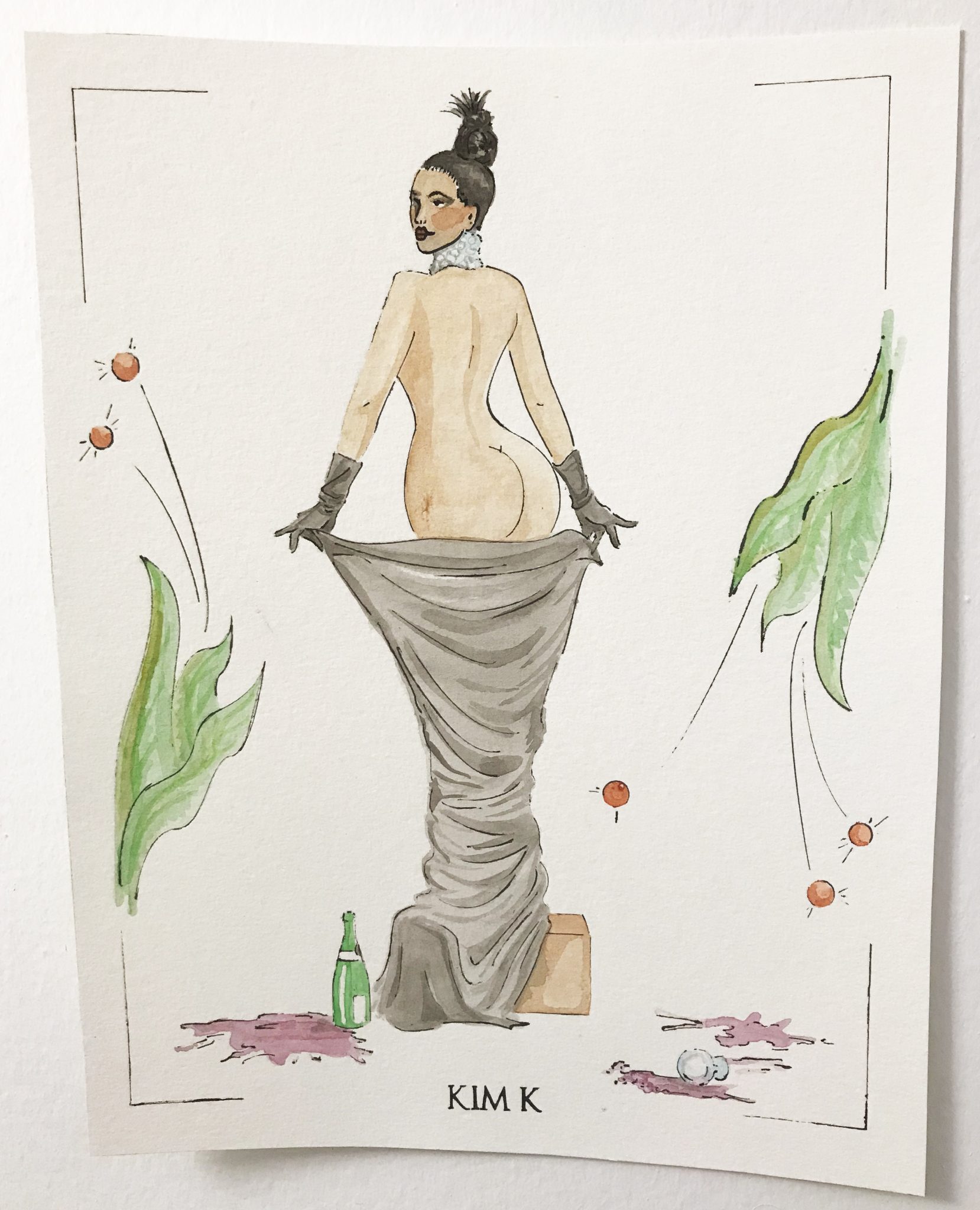
The method of pochoir-style illustration is entirely based on the use of stencils to create an image. The French term pochoir translates into English as stencil. For this blog entry, I examined the many pochoir prints by artist George Barbier that appear in the 1921 volumes of the Gazette du Bon Ton, a French magazine focused on art, fashion and culture. After this examination, and after researching the method of pochoir-style illustration, I decided to recreate the method with the use of modern day technology. The illustration I created borrowed heavily from Georges Barbier’s style, in attempting to recreate a pochoir style print that mimics that of the Gazette du Bon Ton. The subject illustrated in my print, however, is modern day celebrity, Kim Kardashian. I decided to explore the method of pochoir printmaking as a recreating history project, as making and knowing is part of a multi-stage process. The act of making results in a variety of ways of knowing and text alone is not always an optimal method for discourse surrounding object based study and the analysis of making processes (Lehmann 153).
After a trip to the library enclosed within the Royal Ontario Museum, and a brief encounter with the pochoir-style prints in the 1921 issues of the Gazette du Bon Ton, I felt inspired to research further into this illustration style and method. The method was not new in the first quarter of the 20th century and was re-introduced as a method for fashion publishing to differentiate from the mass production of illustrations being made by machine at the time (Cassidy and Zachary, 6). The method of using stencils to create illustrations is one that dates back as far as 40 000 BC. The method was introduced in France after being inspired by Japanese printmakers in the mid 19th century (Cassidy and Zachary 7). Japanese printmakers used stencils to decorate housewares, handheld fans and kimonos, which were prized luxury items coveted by Europeans at this time. By employing the labour-intensive and costly method of pochoir, fashion publications like Vogue; Femina and the Gazette du Bon Ton were able to elevate their publications to the status of luxury objects (Cassidy and Zachary 6).
Although stencils were used in printmaking prior to being used in publications such as the Gazette du Bon Ton, never before was it done with such intricacy and attention to small details and nuance. In the early 20th century, André Marty pioneered the new method for French pochoir illustration, while Jean Saudé is known to have championed the style (Cassidy and Zachary 7). Saudé was able to translate intricate details and colours from photographs and original artist’s illustrations using the method. After the style reached the height of popularity in 1920, it was the method of choice for reproducing images by fine artists beyond just portfolios and illustration, but also in architecture and design as well as fashion. It was also adopted in printing images in books about art. Jazz, a book by Henri Matisse published in 1947 used the method for all of its images, and Pablo Picasso cited use of the method for 200 works produced during his career (Cassidy and Zachary 7).
The Method
The method of pochoir in early 20th century France was broken down by Jean Saudé into an instruction manual to be employed by other artists who wished to use the technique. The first step in reproducing an illustration using the pochoir method involved carefully dissecting the original image by eye, breaking it down into its components, line, colours, highlights and shadows. Saudé took the time to also translate minute details in images into individual stencils also which further elevated the craftsmanship of his execution. The stencils for the image would then be created by a decoupeur, whose job was to hand cut the stencils for the image outline and the coloured fills using a scalpel and thin copper sheet (Cassidy and Zachary 8). To recreate the method today, I broke down an image of Kim Kardashian photographed by Jean-Paul Goude for Paper Magazine in November 2014.
Photo of Kim Kardashian taken by Jean-Paul Goude for Paper Magazine, November 12, 2014. Link to publication: http://www.papermag.com/break-the-internet-kim-kardashian-cover-1427450475.html
I chose to do this in Adobe Illustrator, where I used the digital drawing program to create a stencil using vectored lines, drawing on top of the digital photograph, and attempting to employ the illustration style of Georges Barbier.
Screenshot of Adobe Illustrator drawing in progress of Kim Kardashian Stencil, Photo by Alysia Myette, March 2018.
Additional screenshot of Adobe Illustrator drawing in progress of Kim Kardashian Stencil, Photo by Alysia Myette, March 2018.
Once I had my stencil of the line drawing illustrated, I moved on to making stencils of the fill colours. Though images in the Gazette du Bon Ton would have required upwards of dozens of stencils to create, I used only 16 stencils and added additional details by hand without stencils later.
Screenshot of Adobe Illustrator drawing in progress of Kim Kardashian Stencil and fill colours, Photo by Alysia Myette, March 2018.
After I was done with creating digital line drawings that would act as my stencils I used a laser cutter to replace the labour intensive hand cutting of the stencils. The laser cutter however does not cut through metal, and for this reason I used thin sheets of Durolar, which are water-proof semi-transparent polyester sheets in place of the copper which would have been used originally. Laser cutting software translated my vector images with immaculate precision, but it did take a few trial cuts using the laser and materials to get the stencil perfect. The speed and intensity of the laser had to be refined so as not to leave burnt edges or destroy finer details.
An example of the laser cutting process. The first attempt at laser cutting the stencil (left), a second attempt (middle), the final stencil compared to the first (right). Photos taken by Alysia Myette, Site 3 Collaboratory, Toronto, March 2018.
Jean Saudé instructs that the next step would be to hand the stencils off to a coloriste (or multiple colorists). The job of the coloriste involved using hog-hair bristle brushes, gouache, watercolours and at time metallic paints. A single image could use several dozens of stencils depending on the amount of detail being translated (Cassidy and Zachary 8). In my reproduction of the method, I focused only on making stencils for the most basic of shapes, and added finer details myself later on, due to time constraints.
Pavane. A fashion plate by George Barbier executed in the pochoir method for the Gazette du Bon Ton featuring a dress by Charles Worth. Photo taken by Alysia Myette, Retrieved issue of the Gazette du Bon Ton, Issue 8, October, 1921, courtesy of the Royal Ontario Museum Libraries and Archives, Toronto, March 2018. RB P.S. Ga 250 1921-1922 Oversize.
A detailed view of a fashion plate by George Barbier executed in the pochoir method for the Gazette du Bon Ton featuring a dress by Charles Worth. Photo taken by Alysia Myette, Retrieved issue of the Gazette du Bon Ton, Issue 8, October, 1921, courtesy of the Royal Ontario Museum Libraries and Archives, Toronto, March 2018. RB P.S. Ga 250 1921-1922 Oversize.
I used blank ink to transfer the outline stencil onto watercolour paper with a Micron Sakura pen with a .005mm tip. This allowed for the ink to transfer through the incredibly fine lines cut by the laser cutter.
An image of the ink marker used to transfer the stencil image onto water colour paper. Photo taken by Alysia Myette, March 2018.
I then used watercolours to fill in colours using the addition stencils cut to complete the image. I later went back into the completed image to add finer details such as shadows on the box, the fabric, the gloves, the face and the leaves. Originally, all of these details would have been added using additional stencils so that every image was produced to look exactly the same, requiring an immense amount of labour in each print’s production.
An image of the ink, watercolour paints, brushes and paper used for completing the illustration. Photo taken by Alysia Myette, March 2018.
The final result was impressive, and when pictured side by side with comparing images by Georges Barbier from the Gazette du Bon Ton looks fitting.
The completed pochoir style illustration of Kim Kardashian by Alysia Myette, March 2018.
Kim Kardashian, Luxury, and Making as Knowing
At the time of its initial publication in 1912, the Gazette du Bon Ton was a monthly publication produced by Lucien Vogel. The publication was a limited run series and came with a costly subscription. It was coveted as a luxury item, its name translating into its very definition of a magazine disseminating “good taste” in the areas of art and fashion (Cassidy and Zachary 139). To quote its first issue, the magazine stated “When fashion becomes an art, a fashion magazine must then become an arts magazine”. Vogel positioned the publication to be a highly sought-after fashion magazine by signing contracts with seven of Paris’ leading fashion houses at the time; Paquin; Poiret; Doucet; Doeuillet; Chéruit; Redfern and Worth. Each designer was given one fashion plate per issue, to be executed using the pochoir method. Over 80 illustrators worked for the Gazette du Bon Ton between its initial issue in 1912 and its last in 1925 (Cassidy and Zachary 139). Such illustration artists included Pierre Brissaud, Georges Lepape, George Barbier, Jean Besnard, André Edouard Marty, Charles Martin and Paul Iribe, all who studied at the École des Beaux-Arts (Cassidy and Zachary 140). The fashion plates illustrated by these esteemed fine artists divorced fashion plates from frivolity and elevated fashion designers, as well as the magazine, to a form of high art and culture.
Good taste was communicated through the illustrations and text within the contents of the magazine to its readership. French sociologist and philosopher Pierre Bourdieu describes taste and the ability to discern good from bad taste, as an extension of those members of society who hold higher cultural capital (Rocamora 233). Bourdieu describes culture as both material and symbolic (Rocamora 235). He argues that in order for an object to be considered a work of art, it must be identified as such by the habitus it is placed within (Rocamora 235). In order for the Gazette du Bon Ton to be consumed as a luxury item by its readership it had to communicate not only good taste, but its material composition must communicate value and the contents within it must also communicate symbolic value. The Gazette du Bon Ton’s use of fine artists, with images produced using the pochoir method was indicative of high material value. The contracts signed between the magazine and haute couture fashion houses, as well as its high cost and limited publication run communicated its symbolic value through luxury, exclusivity and good taste.
The readership looking to the Gazette du Bon Ton were looking to the publication in order to remain up to date on the latest trends, much like readers today consume images of celebrities, models and fashion spreads in order to remain on trend and current. I used the image of Kim Kardashian as a modern iteration of this communication of taste. Famous for their wealth and celebrity status, the Kardashian and Jenner sisters are followed on various social media platforms by adorning fans for their fashion, make-up and lifestyle. Outside of starring in their own television show, the sisters model for various designers and photographers, appear on red carpets and have contracts with makeup lines which they endorse. The ways that many viewers “keep up” with the Kardashians, mimics the readership that followed the Gazette du Bon Ton for its communication of fashion, art and culture. My illustration echoes the sentiments of the Gazette du Bon Ton in its pochoir method and illustration style, but also reaffirms its luxury and status by using Kim Kardashian as the model for the fashion plate created.
Special Thanks to the Royal Ontario Museum Libraries and Archives for access to the Fashion collection and archive materials used in this post.
Works Cited
Calahan, April, and Cassidy Zachary. Fashion and the Art of Pochoir: The Golden Age of Illustration in Paris. Thames & Hudson, 2015.
Lehmann, Ulrich. “Making as Knowing: Epistemology and Technique in Craft.” The Journal of Modern Craft, vol. 5, no. 2, 2012, pp. 149-164.
Rocamora, Agnès. “Pierre Bourdieu: The Field of Fashion.” Thinking Through Fashion, I.B. Taurus & Co. Ltd., 2016, pp. 233–250.
Smith, Pamela H. “Introduction: New Directions in Making and Knowing.” West 86th: A Journal of Decorative Arts, Design History, and Material Culture, vol. 23, no. 1, 2016, pp. 3-5.
As a “90’s kid” my Friday nights were spent watching the MuchMusic countdown, and afterwards, Electric Circus. Electric Circus was a program on MuchMusic that was a live streamed electronic dance party. Every Friday night, crowds of eager dancers would line up on Queen Street West waiting to get inside, where dancers would be featured on live television, like a 1990s version of Soul Train. Growing up in Nova Scotia meant that I didn’t have access to clothing that was as unique and colourful as the styles I saw on Electric Circus. At 6 years old when the music video for “Barbie Girl” by Aqua was aired on the program, I realized that I had to make it to Toronto and dance on Electric Circus. I ended up eventually moving to Toronto in 2011, but my childhood dreams to dance on live television were never realized as Electric Circus went off the air in 2003. My love for the fashions of the 90s however, did not die with it. In the winter of 2015, I found the jacket that symbolized my love for the electronic dance party, a vintage Groggy faux fur coat.
I bought the coat after seeing it listed in a Facebook buy and sell group for vintage clothing. I met the woman selling it at the corner of Yonge and Dundas and paid $70.00 cash for the coat I had seen many years before. It was in great condition, and she was selling it because she did not have anywhere to wear it anymore. I hurriedly took it back to the fashion lab on campus at Ryerson University, where I proceeded to make an Instagram post of my amazing find. In the moment of wearing it, I felt that I finally owned a piece of fashion from an era that was now gone.
Instagram Post from January 26, 2015 by Alysia Myette. Image taken at Ryerson University, Toronto, Canada.
The Groggy coat I own is dated to approximately 1995 by the original owner and is in near mint condition. The coat is a 3/4 length style, with a notched shawl collar, and orange buttons that can be fastened to lap in either direction using elastic loops. The shell of the coat is made entirely of white and red-orange faux fur. The under collar and lining are made of hot pink satin. The label inside the coat denotes it was made in China, is 100% acrylic and dry clean only.
The Groggy faux fur coat displayed on a Judy. Photo taken by Alysia Myette.A view of the lining inside the coat. Photo taken by Alysia Myette.
The brand label is the original Groggy logo, adjacent to a size tag reading “small” inside the garment’s collar. On the outside of the garment, a small woven tab with the “G” from the Groggy logo is displayed at the back neck. The only sign of age in the coat, is that the faux fur has turned slightly off white, and is a bit matted at the seat area. There are no holes or stains in the garment, it has all its buttons, and there are hardly any signs of wear and tear.
The exterior tab displaying the Groggy brand at the back neck of the coat. Photo taken by Alysia Myette.The interior Groggy label and size tag. Photo taken by Alysia Myette.
I am surprised at the coat’s generous sizing, as often I fit into a ladies large, but given that the lap at the opening fastens either way, the coat may be read as unisex. Despite owning the coat for 3 years now, I have only worn it a handful of times. It is incredibly bright and soft on the outside, garnering many compliments anytime it is worn out. The loftiness of the coat however, is not overly flattering to the figure of the wearer, and I feel like a giant fluffy ball when I am wearing it. It is a great statement piece to wear when I am attending a nightclub or event and is surprisingly quite warm. Despite the coat not having cost much in terms of money, the value the garment holds is rich in nostalgia. The memories of nights spent staying up past my normal bedtime watching dancers in neon clothing, dyed hair and plastic jewelry, faux fur vests and wide pants dancing atop boxes in the windows of Much Music.
A view of the back of the Groggy coat. Photo taken by Alysia Myette.A close up view of the matted faux fur at the seat area of the Groggy coat. Photo taken by Alysia Myette.
The Groggy brand was based in Montreal and specialized in rave inspired clothing that folded circa 2011 (Trio Group, 2007). The brand produced faux fur coats; jackets; vests; and zip-off cargo skirts as well as printed sweaters and tees. Groggy was sold locally at alternative clothing stores, such as Numb and Noise in downtown Toronto, now both closed. An article, titled Rave Review in Vogue 1997, describes the role that rave culture played in the inspiration for the designs of Marc Jacobs and other luxury fashion designers on the runway (Greeven 114). In a street style article found in the Globe and Mail from January 22, 2000, Geneviève Blouin described her own Groggy clothing as a staple in her wardrobe, citing her favourite zip-off skirt made by Groggy (Pearce).
A still from Marc Jacob’s 1997 Fall Ready to Wear collection. The model is wearing an orange fur vest and wide legged pants. Video found on Youtube at https://www.youtube.com/watch?v=nQmKxuljBBA.
Knowing of Groggy’s popularity in Canada, I scoured the internet to find sources on the company, its designers and additional photos of products, but realized they had little to no online presence. In turning to social media, many friends who attended Raves in the 1990s offered photos of themselves in Groggy clothing, and their current collection of vintage pieces.
Tristan, who at the time went by “DJ MoldyLox” in Halifax, Nova Scotia, described finding many of his pieces at a local Winners when the company folded, and is seen pictured in their Groggy sweater, DJ’ing below:
Tristan (Dj MoldyLox) DJing wearing a Burgundy Groggy brand sweater. Images provided by Tristan in a personal communication with permission to use for this blog.A close up view of the Groggy logo printed on the sleeve of the sweater. Images provided by Tristan in a personal communication with permission to use for this blog.
Rhia, a local Toronto raver, sent pictures of her own impressive faux fur collection by Groggy. Pictured below are numerous Groggy coats she owns and photos showing how the pieces are mixed and styled with the Raver fashions of today.
Rhia (RaveFae)’s personal collection of Groggy faux fur coats. Images provided by Rhia in a personal communication with permission to use for this blog.Rhia wearing her own Groggy coat identical to my own on a night out. Images provided by Rhia in a personal communication with permission to use for this blog.
Raves, as they were in the 1990s, are assumed to have mostly ended around the globe at the end of the 20th century (Van Deen 30). Raves were dance parties, advertised quietly, promoting happiness and good feelings through dance, electronic music and often the use of illicit drugs in large, open and unoccupied spaces. Attendees were encouraged to lose themselves to dance (Wilson 385). Toronto’s rave subculture began in the early 1990s, despite raves having started in the UK in the late 1980s (McCall 33). The first officially reported rave occurred in 1991 in Toronto. While clubs were known to have dress codes raves were very accessible, with an anything goes attitude (McCall 33). The raver style often borrowed from a combination of hip-hop, snowboarding and skateboarding clothing styles (McCall 120). The style of raver clothing can be broken down into four categories. The “Sporty” look, consists of baggy clothing, often by Adidas or similar sports brands, with matching shirts, pants and sneakers. The “Return to Childhood” styles which embodied youth and innocence, with bright plastic jewelry, and cartoon character prints. The “Outrageous Costume” style, consists of neon colours, platform shoes, faux fur, see-through vinyl and coloured lens glasses. This is where I feel my groggy jacket is positioned comfortably, as it would have made a loud statement. Lastly, the “Nothing Special” style, which was a direct transition from daywear to night, often just jeans and tee-shirts (Wilson 399).
A photo of Raver fashion taken from casting director Caroline Johnson-Stephens’ Instagram account, models unknown. Both images detail fashions worn by ravers of the 1990s. Link: https://www.instagram.com/carolinecasting/Another photo of Raver fashion taken from casting director Caroline Johnson-Stephens’ Instagram account. Link: https://www.instagram.com/carolinecasting/
Brian Wilson describes the rave subculture as a form of symbolic “purposeful-tactical” resistance. In subcultural groups; youth culture and counter culture, bodies offer prime sites for resistance, often through the use of clothing (Tynan 192). Resistance in fashion, as defined by French historian and philosopher Michel Foucault, is the subverting of normalized dress and the ability for bodies to transcend subordination through dress (Tynan 195). Ravers can be described as symbolically, subtly and purposefully resisting mainstream value systems and culture through their dress. This is also done so through the promotion of the PLUR (Peace, Love, Unity, Respect) value system (Wilson 401). This philosophy, and doctrine of rave attendees, upholds the social values within the subculture, with the use of high-technology as a means to gain pleasure and empowerment as well as to seek and experience pleasure (Wilson 384). Rave culture embraces the liberation of coded gender and sexuality, in its creation of nonsexist spaces of encounter and unisex clothing (Alwokeel 55, Van Deen 44). This resistance also takes form through the use of illicit drugs as a subtle reaction (as drug use was not advertised or placed on public display) to the hypocritical mainstream rejection of drugs and acceptance of alcohol (Wilson 399). This form of resistance stands in contrast to subcultures like punk, where issues of class, gender and race manifest into aggression and confrontation. The PLUR philosophy stands in resistance even to other subcultures, embracing positivity through escapism, comfort and pleasure.
In comparison to punk subculture, which explicitly displays anti-capitalist symbols through dress, Rave culture was subdued. Ravers adopted looks that were cute and cuddly. The tactile nature of the materials used in rave style clothing, directly resulted as a response to the types of drugs being taken at raves. Substances like Ecstasy and MDMA, elicited a heightened sensitivity to tactile materials (McCall 169). A coat like the one I own consisting of bright coloured faux fur would elicit pleasure when touching it and harmonize with the sentiments felt when taking these types of drugs.
A GIF image from the film “Get Him to The Greek” (2010) starring Russell Brand and Jonah Hill. The moving image shows Brand instructing Hill, who has taken many drugs at a party, to stroke the furry wall in an effort to calm him down. Link to source: https://78.media.tumblr.com/.
Rave culture, however resistant, actively supports the reproduction of dominant culture, while passively subverting it. While raves were happening, and becoming further publicized, design and music began to profit from the “rave” style (Wilson 407). Rave culture grew faster than the clothing labels trying to adopt their styles into production which resulted in many ravers making their own clothing. Like most anti-fashion, the style did not remain unique forever and brands like Groggy began to emerge selling rave style clothing to consumers. This also created a homogenous rave style, in where ravers could be identified aesthetically by their sartorial choices, promoting a form of assimilation within the subculture itself. Other similar brands included Mod Robes, JNCO, Clobbers and Snug. In the adoption of rave culture into mainstream fashion, ravers began to abandon the subcultural, realizing it had become corporatized and homogenized. This is likened to George Simmel’s critique of the adoption of fashion in his trickle-down theory, in that when a fashion becomes adopted by the majority of persons, it is no longer in fashion (Simmel 547).
Moby, a staple in electronic and techno music at raves and in the 1990s, embraced the raver style himself. His autobiography, with chapters such as “Neon Green Muppet Monster Fur”, “PVC Bodysuit” and “Orange Jacket”, gives a well-rounded idea as to how the clothing of rave subculture was visibly defined in its style (Moby 8). In his music video for “Southside” with Gwen Stefani below, Moby sports a faux fur jacket nearly identical to my own Groggy jacket.
A still image from Moby’s music video for “Southside” featuring Gwen Stefani. Image taken from Moby’s official Youth channel. Link to video: https://www.youtube.com/watch?v=GXKg0sNTKXE.
The adoption of the raver style did not stop at the fashion industry in stores or on the runway, but even permeated the children’s toys industry. Mattel in 1999 released a “Happenin’ Hair Barbie” seen in the commercial below that rocked colour-changing hair, wide legged jeans and sparkly neon tops.
It would seem that rave subculture in the 1990s has passed, but trends from this era are still alive and well today, with new electronic music lovers seeking out vintage clothing to complete their looks. The underground all-night multi-room raves held in abandoned warehouses seem to have passed, but the subculture is still alive and well. New forms of raves are taking place all over Toronto, in the forms of festivals and themed club nights with extended last-call times. Despite never getting to dance at Electric Circus I have my Groggy coat that hanging in my closet, serves as a nostalgic artefact.
For Discussion
Is anti fashion, fashion in subcultures, and other forms of fashion that disrupt mainstream fashion trends like rave culture a form of resistance if the clothing is produced by large retail chains?
Does this follow Simmel’s trickle down theory of fashion in stating that society follows fashion to fit in, or does it disrupt this idea in that individuals are trying to stand out? Are individuals actually standing out if they fit in within a subculture?
Acknowledgements:
Special thanks to Shari Schulist, the original owner of the Groggy jacket who was able to date and confirm the place of purchase of the Groggy coat. A huge thank you as well to Tristan, Rhia and Ronak, who shared personal stories with me about their own Groggy items, as well as photos.
Works Cited
Alwakeel, Ramzy. “The Aesthetics of Protest in UK Rave.” Dancecult, vol. 1, no. 2, 2010, pp.50–62. ProQuest, doi:10.12801/1947-5403.2010.01.02.03.
Tynan, Jane, et al. “Michel Foucault: Fashioning the Body Politic.” Thinking Through Fashion,I.B. Tauris, 2015, pp. 184–199.
Veen, Tobias C. Van. “Technics, Precarity and Exodus in Rave Culture.” Dancecult, vol. 1, no. 2, 2010, pp. 29–49. ProQuest, doi:10.12801/1947-5403.2010.01.02.02.
Wilson, Brian. “The Canadian Rave Scene and Five Theses on Youth Resistance.” Canadian Journal of Sociology / Cahiers canadiens de sociologie, vol. 27, no. 3, 2002, pp. 373–412. JStore, doi:10.2307/3341549.