A Brief Introduction to Pochoir
The method of pochoir-style illustration is entirely based on the use of stencils to create an image. The French term pochoir translates into English as stencil. For this blog entry, I examined the many pochoir prints by artist George Barbier that appear in the 1921 volumes of the Gazette du Bon Ton, a French magazine focused on art, fashion and culture. After this examination, and after researching the method of pochoir-style illustration, I decided to recreate the method with the use of modern day technology. The illustration I created borrowed heavily from Georges Barbier’s style, in attempting to recreate a pochoir style print that mimics that of the Gazette du Bon Ton. The subject illustrated in my print, however, is modern day celebrity, Kim Kardashian. I decided to explore the method of pochoir printmaking as a recreating history project, as making and knowing is part of a multi-stage process. The act of making results in a variety of ways of knowing and text alone is not always an optimal method for discourse surrounding object based study and the analysis of making processes (Lehmann 153).
After a trip to the library enclosed within the Royal Ontario Museum, and a brief encounter with the pochoir-style prints in the 1921 issues of the Gazette du Bon Ton, I felt inspired to research further into this illustration style and method. The method was not new in the first quarter of the 20th century and was re-introduced as a method for fashion publishing to differentiate from the mass production of illustrations being made by machine at the time (Cassidy and Zachary, 6). The method of using stencils to create illustrations is one that dates back as far as 40 000 BC. The method was introduced in France after being inspired by Japanese printmakers in the mid 19th century (Cassidy and Zachary 7). Japanese printmakers used stencils to decorate housewares, handheld fans and kimonos, which were prized luxury items coveted by Europeans at this time. By employing the labour-intensive and costly method of pochoir, fashion publications like Vogue; Femina and the Gazette du Bon Ton were able to elevate their publications to the status of luxury objects (Cassidy and Zachary 6).
Although stencils were used in printmaking prior to being used in publications such as the Gazette du Bon Ton, never before was it done with such intricacy and attention to small details and nuance. In the early 20th century, André Marty pioneered the new method for French pochoir illustration, while Jean Saudé is known to have championed the style (Cassidy and Zachary 7). Saudé was able to translate intricate details and colours from photographs and original artist’s illustrations using the method. After the style reached the height of popularity in 1920, it was the method of choice for reproducing images by fine artists beyond just portfolios and illustration, but also in architecture and design as well as fashion. It was also adopted in printing images in books about art. Jazz, a book by Henri Matisse published in 1947 used the method for all of its images, and Pablo Picasso cited use of the method for 200 works produced during his career (Cassidy and Zachary 7).
The Method
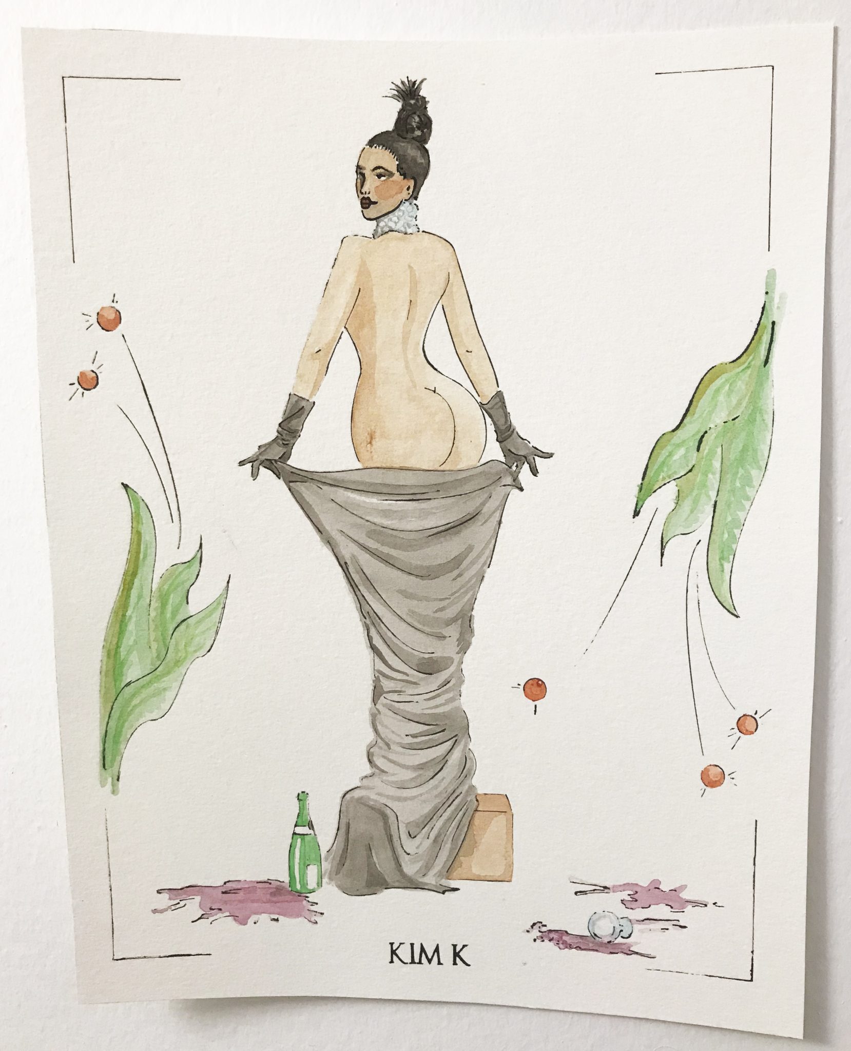
The method of pochoir in early 20th century France was broken down by Jean Saudé into an instruction manual to be employed by other artists who wished to use the technique. The first step in reproducing an illustration using the pochoir method involved carefully dissecting the original image by eye, breaking it down into its components, line, colours, highlights and shadows. Saudé took the time to also translate minute details in images into individual stencils also which further elevated the craftsmanship of his execution. The stencils for the image would then be created by a decoupeur, whose job was to hand cut the stencils for the image outline and the coloured fills using a scalpel and thin copper sheet (Cassidy and Zachary 8). To recreate the method today, I broke down an image of Kim Kardashian photographed by Jean-Paul Goude for Paper Magazine in November 2014.

Link to publication: http://www.papermag.com/break-the-internet-kim-kardashian-cover-1427450475.html
I chose to do this in Adobe Illustrator, where I used the digital drawing program to create a stencil using vectored lines, drawing on top of the digital photograph, and attempting to employ the illustration style of Georges Barbier.


Once I had my stencil of the line drawing illustrated, I moved on to making stencils of the fill colours. Though images in the Gazette du Bon Ton would have required upwards of dozens of stencils to create, I used only 16 stencils and added additional details by hand without stencils later.

After I was done with creating digital line drawings that would act as my stencils I used a laser cutter to replace the labour intensive hand cutting of the stencils. The laser cutter however does not cut through metal, and for this reason I used thin sheets of Durolar, which are water-proof semi-transparent polyester sheets in place of the copper which would have been used originally. Laser cutting software translated my vector images with immaculate precision, but it did take a few trial cuts using the laser and materials to get the stencil perfect. The speed and intensity of the laser had to be refined so as not to leave burnt edges or destroy finer details.

Jean Saudé instructs that the next step would be to hand the stencils off to a coloriste (or multiple colorists). The job of the coloriste involved using hog-hair bristle brushes, gouache, watercolours and at time metallic paints. A single image could use several dozens of stencils depending on the amount of detail being translated (Cassidy and Zachary 8). In my reproduction of the method, I focused only on making stencils for the most basic of shapes, and added finer details myself later on, due to time constraints.

Photo taken by Alysia Myette, Retrieved issue of the Gazette du Bon Ton, Issue 8, October, 1921, courtesy of the Royal Ontario Museum Libraries and Archives, Toronto, March 2018. RB P.S. Ga 250 1921-1922 Oversize.

Photo taken by Alysia Myette, Retrieved issue of the Gazette du Bon Ton, Issue 8, October, 1921, courtesy of the Royal Ontario Museum Libraries and Archives, Toronto, March 2018. RB P.S. Ga 250 1921-1922 Oversize.
I used blank ink to transfer the outline stencil onto watercolour paper with a Micron Sakura pen with a .005mm tip. This allowed for the ink to transfer through the incredibly fine lines cut by the laser cutter.

I then used watercolours to fill in colours using the addition stencils cut to complete the image. I later went back into the completed image to add finer details such as shadows on the box, the fabric, the gloves, the face and the leaves. Originally, all of these details would have been added using additional stencils so that every image was produced to look exactly the same, requiring an immense amount of labour in each print’s production.

The final result was impressive, and when pictured side by side with comparing images by Georges Barbier from the Gazette du Bon Ton looks fitting.

Kim Kardashian, Luxury, and Making as Knowing
At the time of its initial publication in 1912, the Gazette du Bon Ton was a monthly publication produced by Lucien Vogel. The publication was a limited run series and came with a costly subscription. It was coveted as a luxury item, its name translating into its very definition of a magazine disseminating “good taste” in the areas of art and fashion (Cassidy and Zachary 139). To quote its first issue, the magazine stated “When fashion becomes an art, a fashion magazine must then become an arts magazine”. Vogel positioned the publication to be a highly sought-after fashion magazine by signing contracts with seven of Paris’ leading fashion houses at the time; Paquin; Poiret; Doucet; Doeuillet; Chéruit; Redfern and Worth. Each designer was given one fashion plate per issue, to be executed using the pochoir method. Over 80 illustrators worked for the Gazette du Bon Ton between its initial issue in 1912 and its last in 1925 (Cassidy and Zachary 139). Such illustration artists included Pierre Brissaud, Georges Lepape, George Barbier, Jean Besnard, André Edouard Marty, Charles Martin and Paul Iribe, all who studied at the École des Beaux-Arts (Cassidy and Zachary 140). The fashion plates illustrated by these esteemed fine artists divorced fashion plates from frivolity and elevated fashion designers, as well as the magazine, to a form of high art and culture.
Good taste was communicated through the illustrations and text within the contents of the magazine to its readership. French sociologist and philosopher Pierre Bourdieu describes taste and the ability to discern good from bad taste, as an extension of those members of society who hold higher cultural capital (Rocamora 233). Bourdieu describes culture as both material and symbolic (Rocamora 235). He argues that in order for an object to be considered a work of art, it must be identified as such by the habitus it is placed within (Rocamora 235). In order for the Gazette du Bon Ton to be consumed as a luxury item by its readership it had to communicate not only good taste, but its material composition must communicate value and the contents within it must also communicate symbolic value. The Gazette du Bon Ton’s use of fine artists, with images produced using the pochoir method was indicative of high material value. The contracts signed between the magazine and haute couture fashion houses, as well as its high cost and limited publication run communicated its symbolic value through luxury, exclusivity and good taste.
The readership looking to the Gazette du Bon Ton were looking to the publication in order to remain up to date on the latest trends, much like readers today consume images of celebrities, models and fashion spreads in order to remain on trend and current. I used the image of Kim Kardashian as a modern iteration of this communication of taste. Famous for their wealth and celebrity status, the Kardashian and Jenner sisters are followed on various social media platforms by adorning fans for their fashion, make-up and lifestyle. Outside of starring in their own television show, the sisters model for various designers and photographers, appear on red carpets and have contracts with makeup lines which they endorse. The ways that many viewers “keep up” with the Kardashians, mimics the readership that followed the Gazette du Bon Ton for its communication of fashion, art and culture. My illustration echoes the sentiments of the Gazette du Bon Ton in its pochoir method and illustration style, but also reaffirms its luxury and status by using Kim Kardashian as the model for the fashion plate created.
Special Thanks to the Royal Ontario Museum Libraries and Archives for access to the Fashion collection and archive materials used in this post.
Works Cited
- Calahan, April, and Cassidy Zachary. Fashion and the Art of Pochoir: The Golden Age of Illustration in Paris. Thames & Hudson, 2015.
- Lehmann, Ulrich. “Making as Knowing: Epistemology and Technique in Craft.” The Journal of Modern Craft, vol. 5, no. 2, 2012, pp. 149-164.
- Rocamora, Agnès. “Pierre Bourdieu: The Field of Fashion.” Thinking Through Fashion, I.B. Taurus & Co. Ltd., 2016, pp. 233–250.
- Smith, Pamela H. “Introduction: New Directions in Making and Knowing.” West 86th: A Journal of Decorative Arts, Design History, and Material Culture, vol. 23, no. 1, 2016, pp. 3-5.
I remember when you showed me some of the line art for this – I was impressed then, and I’m even more impressed now! I don’t think I’ve ever considered the method of image production when approaching something semiotically – I know you drew primarily on Bourdieu, but this gave me some insight into Barthes as well.
Thank you so much!
I really enjoyed making it also.
Alysia, I think it was very bold of you to recreate a pochoir-style illustration. I think it turned out great! Documenting your process work was especially helpful in conveying the luxury aspect and complexity of pochoir. I also think that the choice of celebrity and photo was clever.
You recreated the piece as a way of knowing. I wonder how the experience of the illustrators of the time differed from yours. Evidently, there was a difference in technology available, but also, the quantities of illustrations produced were vastly different.
I also think it would be interesting to examine the similarities and differences between modern day photography (and Photoshop), and pouchoir illustrations. Both have interpretive qualities, and can manipulate images of real bodies. Oh how some things never change!