Humour, satire and the body

Fig. 1 – La Gazette du Bon Ton second issue cover. Photo courtesy Royal Ontario Museum and Archives, 27 Feb. 2018.

It is surprising that a magazine from one hundred and six years ago still preserves its print qualities as if it had been produced recently (fig. 1). La Gazette du Bon Ton first issue dates from November 1912 but the one analyzed here is the second issue from December 1912 and is part of the Royal Ontario Museum’s collection (v. 1, no. 2). What draws attention to this particular magazine is the treatment of content and illustrations. La Gazette du Bon Ton is the product of Lucien Vogel’s mind. An art-director turned editor-in-chief (Davis 49), Vogel was inspired by the quality of Le Journal des Dames et des Modes, the last publication that valued “high standards of production”. Le Journal ceased to be printed when its publisher passed away, opening space for “cheaply produced journalism for mass circulation” (Lepape and Defert 69). In that current state of low-quality publication, the Gazette aimed to elevate fashion to the condition of art, giving to it the same prestige as painting, sculpture and drawing enjoyed in the early years of the twentieth century. The magazine as media also had to be treated as a work of art. The Gazette’s first edition declared “[w]hen fashion becomes an art, a fashion gazette must itself become an arts magazine” (Lepape and Defert 72). Fashion at the time was “not simply reflecting social change, it was also undergoing an internal stylistic revolution” (Steele 208). On its pages, La Gazette was pairing artists and couturiers in a pursuit to present readers a way of life rooted in good taste and elegance with a touch of humour (Davis 49).

And indeed La Gazette du Bon Ton emanates an artisanal feel due to its small size, pages with rough edges that appear to have been ripped from a larger sheet. The paper is coarse and textured, appropriate for painting and for the pochoir technique and the pages are stack together rather than bound, adding an extra touch of sophistication; its fashion plates could be, therefore, framed as little pictures (Lepape and Defert 69). The illustrations on fashion plates, signed by the illustrator/artist contrast with those used in the editorial pages. They are more elaborate, presenting different drawing styles depending on the artist’s style. The layout throughout is designed with large margins all around, copy or illustration is located in the centre of the page, there is a consistent matching colour palette, and the typography is clean and easy to read. Each spread is carefully designed to privilege blank spaces in relation to content. Drawings on style pages are accurate representations of the accessories and clothes suggested for use in the elaborate and quite extensive accompanying text. In one story (see fig. 2 and 3), the subject is winter sports, and the copy gives suggestions about appropriate garments to wear, how to combine them with accessories and further report about the place the reader will visit, offering travel tips.

Fig. 2 – feature story about winter clothing. Photo courtesy Royal Ontario Museum and Archives, 27 Feb. 2018.


Fig. 3 – Example of illustrations. Photo courtesy Royal Ontario Museum and Archives, 27 Feb. 2018.

It seems the Gazette was also relying on the social capital of its readership to reinforce its prestige as a publication that was poised to dictate good taste. Bourdieu defines social capital as “membership in a group – which provides each of its members with the backing of the collectivity-owned capital, a ‘credential’ which entitles them to credit, in the various senses of the word” (Bourdieu 248-249). Sold under a subscription-only model, La Gazette cost 100 francs per year, a significant amount of money, which positioned the publication for an audience on a higher income level (Davis 50). Established authors, or as the Gazette’s announcement proclaimed “the most brilliant reporters” (Lepape and Defert 73) wrote about topics of interest to an elite immersed in matters of art, music and high culture in general (Davis 51). Thus, as Bourdieu explains, there must be a demand of effort to maintain a social capital, “which implies expenditure of time and energy and so, directly and indirectly, of economic capital, is not profitable or even conceivable unless one invests in it a specific competence” (Bordieu 250).


Fig. 4 – Plates explanation page. Photo courtesy Royal Ontario Museum and Archives, 27 Feb. 2018.

Fashion plates

Fashion plates were the focus of attention at La Gazette du Bon Ton. Each issue included “ten plates coloured by the pochoir process and accompanied by captions and short articles in a witty or light-hearted vein” (Lepape and Defert 72). In the end, there was a list called “Explication des Planches” (Explanation of Plates, see fig. 4), a description of each garment presented and, for this second edition, signed by Lucien Vogel. This extra text inserted apart from the plates themselves, separates fashion from art, in a sense that garments featured could spoil their artistic rendering with language that was both essentially banal and part of the discourse typical of fashion. Bourdieu and Delsaut argue that “words that are used in fashion writing do not simply describe the value of objects they are related to, they make it” (Rocamora 239). For both Pierre Bourdieu and Roland Barthes, “fashion exists not only through clothes but also through discourses on them” as explained by Rocamora in her article, “Pierre Bourdieu: The Field of Fashion” about that author’s work. Clothing on Gazette’s plates is given a new meaning when we compare the captions of the plates with the description on the explanation list. Take for example plate Pl. IV (fig. 5): the illustration’s subtitle reads “Le Soir Tombe… – Robe de Soir de Doucet (Evening falls… Evening gown by Doucet). While, on the explanation list, there is a full description in regards to the fabrics, colours, patterns and other materials that were used to make this outfit, such as white fox fur. Both texts talk about the same garment, but in two different ways. The caption does what Barthes defined as “rhetorical code, concerning how fashion is translated into words and images in magazine spreads…his concern is with clothing as text or sign” (Jobling 134). Because this caption calls the outfit an “evening gown” it can only be understood as such while the descriptive text reinforces the sophisticated nature of the materials used to produce it, so, there is no other possible interpretation for this piece (sign), despite resembling a nightgown, for sleeping.


Fig. 5 – Evening falls… Evening gown by Doucet, 1912. Photo courtesy Royal Ontario Museum and Archives, 27 Feb. 2018.

Is this funny?

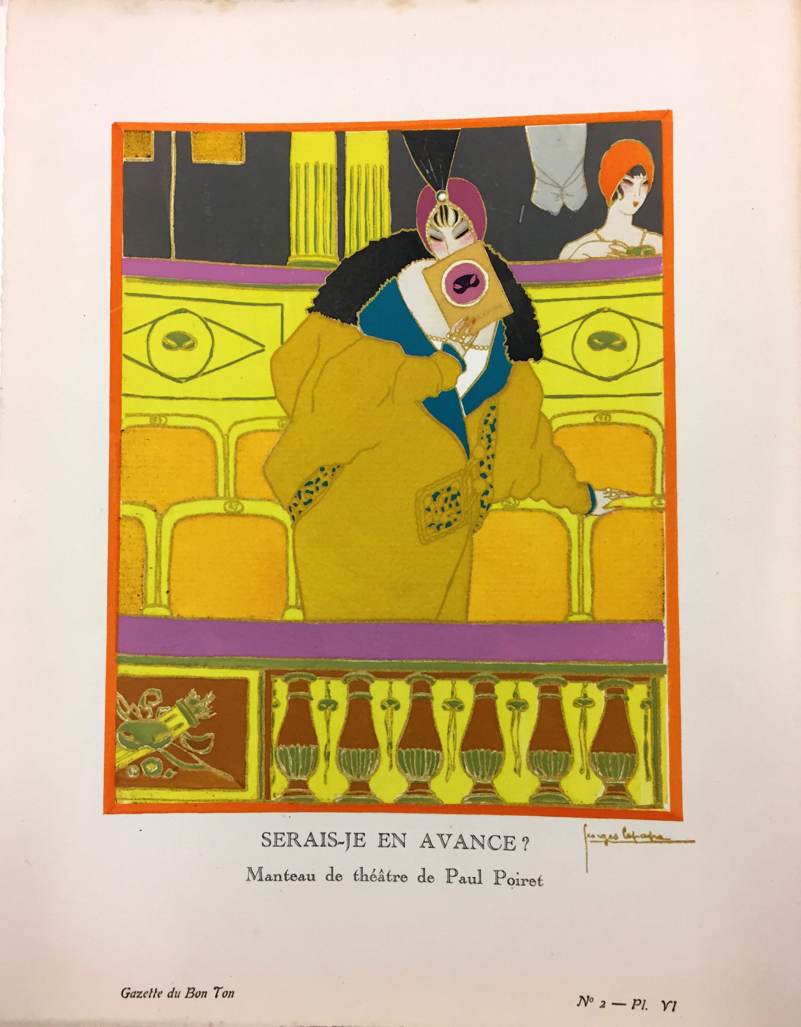
Text on fashion plates also made use of smart and humourous language, but as George Lepape defined, they were “in somewhat mocking and ironic terms” (Lepape and Defert 72). One example is the “Le Soir Tombe…” plate mentioned above and its subtle humour. Tomber in French means “to fall” but it sounds almost like tombeur which means “ladykiller”. So, in this illustration, the night falls, as does her dress, and she is ready to prey on men. Lepape was one of the artists that illustrated the pages of the Gazette and had previously contributed his work to the Salon des Humoristes (Lepape and Defert 58). One of his plates entitled “Serais-Je En Avance? – Manteau de théatre de Paul Poiret” (Pl.VI, Am I Early? – Theater Coat by Paul Poiret, see fig. 6) exemplifies the witty caption combined with a stylish drawing. The humour in this plate comes from this woman arriving early to the theatre, on purpose, to draw attention to herself and her vivid coat. The plate is also illustrated with vibrant colours that “vibrate on the page, and are matched in the fantastical depiction of the theatre itself … the scene suggests the general sensibility of the Ballets Russes and evokes with particular clarity the exotic world and stunningly aggressive colour scheme of Schéhérazade” (Davis 54). The kind of humour portrayed in this and other plates, seems restrained, to be consistent with the tastes of the Gazette’s readers. The Bon Ton, or good taste, on the Gazette’s name is in this case, “aesthetic experience … as a socially and historically constituted opposition” (Rocamora 241). Bourdieu argues, taste is a construction of the dominant class, whereby taste marks the dominant class and therefore dominant culture (Rocamora 242).

Fig. 6 – Am I Early? – Theatre Coat by Paul Poiret, 1912. Photo courtesy Royal Ontario Museum and Archives, 27 Feb. 2018.

In contrast, humour in satires was far more explicit in relation to fashion and they “disdained those who dressed outside their immediate age group or, worse, those who dressed above their social station, posing an alarming threat to the social status quo” (Flood and Grant 23). Fashion satires employed exaggeration to the depictions of fashionable people (Flood and Grant 8). Distortion of body parts presents a fine line between satire, as in fig. 6, and the women illustrated on the Gazette’s fashion plates. While men were often illustrated in a fairly proportionate way (see fig. 7). It was not the magazine’s intention to mock their audience, as Davis reminds “the magazine conveyed an artistic tone and an aristocratic aura that firmly distinguished it from the ever-burgeoning ruck of fashion periodicals” (51). However, female figures were sometimes depicted in a fragile manner, often looking like they were losing balance, or with an arched back, giving a sense of instability reinforced by their small feet. In the words of art historian and Gazette’s contributor, Jean-Louis Vaudoyer (Davis 50) regarding George Lepapes’ art “[t]he type of woman created by Monsieur Lepape is not a femme fatale. He favours what our songwriters call ‘little angels’: tiny rosebud mouths, eyes round with surprise, partly tilted noses” (Lepape and Defert 76). Lepape defined his fashion illustration work as “a realistic drawing, but very stylized, bold and sumptuous, reflecting a life of elegance” (Lepape and Defert 43). This idea can also be seen in the style of other artists, not only for fashion plates but also on the renderings of garments that illustrate the stories.

The resulting portrayal of women comes close to the fashion satire and the less elegant frame La Gazette du Bon Ton so keenly tried to distance itself from. The Gazette gives us a glimpse of how high-quality fashion magazines looked like at the beginning of the twentieth century. It is an exquisite product made for an elite to read with no comparison to today’s mass circulation publications.

Fig. 7 – Male body in depicted proportionately, 1912. Photo courtesy Royal Ontario Museum and Archives, 27 Feb. 2018.


Discussion question

1. Are niche fashion magazines today emulating Bourdieu’s idea of discourse as a sign of differentiation and creating a hierarchy and therefore positioning themselves at a higher level in comparison to the popular ones?


Works Cited

Bourdieu, Pierre. “The Forms of Capital.” Handbook of Theory and Research for the Sociology of Education. edited by J. Richardson, Greenwood, 1986, pp. 241-258.

Davis, Mary E. “La Gazette du Bon Ton”. Classic Chic: Music, Fashion, and Modernism. vol. 6, University of California Press, 2006, pp. 48-92.

Flood, Catherine, and Sarah Grant. Style and Satire: Fashion in Print, 1777-1927. V&A Publishing, 2014.

Jobling, Paul. “Roland Barthes: Semiology and the Rhetorical Codes of Fashion.” Thinking through Fashion: A Guide to Key Theorists. edited by Agnès Rocamora and Anneke Smelik, I.B. Tauris, 2016, pp. 130-148.

Lepape, Claude, and Thierry Defert. From the Ballets Russes to Vogue: The Art of Georges Lepape. Vendome Press, 1984.

Rocamora, Agnès. “Pierre Bourdieu: The Field of Fashion.” Thinking through Fashion: A Guide to Key Theorists. edited by Agnès Rocamora and Anneke Smelik, I.B. Tauris, 2016, pp. 233-250.

Steele, Valerie. Paris Fashion: A Cultural History. Bloomsbury USA, 2017.

A sweatshirt as a memory

“Here, you can have this back. I think if we continue to wash it will fade away,” my husband alerts me while handing me back a sweatshirt he had taken from my closet sixteen years before (see fig. 1). My father had bought it for me sometime in the mid-nineties when I was a teenager. Usually, fashion information, dressing habits, clothing exchange and even consumer purchase attitudes appear from the relationship between mothers and daughters (Appleford 153; Kestler and Paulins 314). Not in my case. Most of my knowledge and taste for anything related to design comes from my father, an industrial designer who enjoys fashion more than my mother ever did. I was around 15 years old, living in my native country, Brazil, and desperately wishing to own designer clothes my father could not afford. He then proposed a deal that would benefit us both: he would buy male garments from the brands I wanted so we could share. That is why this sweatshirt fits my husband and me. He had found this garment when he was looking for an old piece of clothing to wear to sleep. I had stopped wearing this sweatshirt because it no longer spoke to me and its fashionable life had finished. My husband wore it as a pyjama top until last year, when it started to rip apart (see fig. 2). The fabric is becoming thinner on the elbows; side seams are split open, there is a hole on one armpit, and the sleeves openings are tearing into shreds.


fig. 1 – the sweatshirt in use
fig. 2 – front side


Brazilian fashion and the 1990s

I cannot recall precisely the year I acquired the sweatshirt, but I remember it was from the same brand store that appears on both labels, placed inside and outside close to the neckline (see fig 3). Launched in 1990, Zapping was the second line of Zoomp, one of the most influential denim brands at that time (Kherlakian 49). Their collections were aimed a young audience of people between 15 and 25 years-old (Lucchesi), designed to please distinct groups and tastes like urban art, hip-hop, skate and club cultures (Kherlakian 211). Zapping’s style evolved over the decade with the mixing of references as its core principle and in line with anthropologist’s Ted Polhemus concept of “supermarket of style” (Polhemus 10; Palomino MorumbiFashion). Polhemus critiques the time when subcultures used style to set them apart from other groups, and, in the 1990s, there was a proliferation of style options that made everyone play and test all of what was available for consumption like cans of soup in a supermarket shelf (10). He saw this phenomenon as superficial because no one had a deep commitment to an idea like the mods or punks had in the past, thus resulting in fragmentation and inauthenticity like the cyberpunks, grunge haute couture or “acid jazzers” (Polhemus 11).

fig. 3 – sweatshirt’s back

The Brazilian fashion industry in the nineteen-nineties was experiencing rapid expansion, boosted in part by economic stability and eagerness among fashion designers fresh out of university to build an identity compatible with the country’s culture (Bonadio 70). As Maria Claudia Bonadio explains, Brazil’s production had, so far, been associated with natural landscapes and indigenous and popular cultures (71). Brands like Osklen and Carlos Miele still explore “exoticism” in their designs, limiting the capacity for other themes to emerge within the fashion community that could potentially open more the national market for global exportation (72).

The brands I followed in that decade, were proposing a style as a blend of mainstream Brazilian culture and international trends from designers such as John Galliano for Dior, Prada and Helmut Lang (Palomino, Supermercado), to the streetwear movement unique to the city I was born, Sao Paulo. I remember that in my group of friends there was a desire to be part of a technologically advanced future, increasingly connected by the internet and the possibilities of knowledge that lingered in our imaginations at the end of the millennium. A T-shirt, a pair of jeans or sweatshirts were all used as symbols to represent our tastes in music, art and movies. It showed how we placed ourselves in groups of people like us, reaffirming Polhemus’ “supermarket of styles” idea, but with substance. “Deconstructivism, gender-bending and androgyny” were concepts that Zapping translated into clothing in a call for inclusiveness and a tool for self-expression (Palomino Jovens Desconstrutivistas). Embodied by the clashing of hair and makeup styles against normal clothes to create unusual looks such as a punk dressed in khakis (Fassina).

fig. 4 – side seam ripped open, shows fabric’s inside design

Despite materials like neoprene, vinyl, glazed cotton and plastic, Zapping had comfort as the ultimate goal (Folha de S. Paulo 3-12), and my sweatshirt is proof of that. It is probably made of cotton (the care label is missing) and is constructed with the fabric’s design side turned inwards bringing the inside texture outside and making it a design feature (see fig. 4). The overall sweatshirt appearance is rough, reinforced by the terracotta colour and the stripe print resembling a ripped piece of paper, originally yellow with another green stripe in the centre. Due to constant washing, the green stripe is now almost entirely faded. This print circulates around one sleeve, jumps diagonally to the bodice, ending on the other sleeve. The sweatshirt’s colour combination alludes to the natural Brazilian reddish soil, and its ripped effect caused by the uneven yellow and green stripes resembles a harvest mark on the dirt. Although sold as a male garment, the collar is wide (26cm, 10.25 inches), the cut is loose, making it comfortable to wear by any body type, therefore marking it as a unisex piece. The sweatshirt size is probably small (the size label is also missing) because both my father and I are short, so I suppose we bought it to fit us true-to-size. Since it was designed with the male body in mind, it fits me a little larger than in my husband. The bodice width is 29cm (11 inches), 65cm long (26 inches), the sleeves’ seams are dropped from the shoulder, and they sit at wrist length. All edge finishes on the neck, hem and sleeves lines are stitched to prevent unravelling making them roll inwards a little, reinforcing the rough appearance of the sweatshirt.


Material Culture

I had not noticed the importance the sweatshirt acquired over time until it was given back to me. My husband realized this when he told me to store it. I have a small collection of pieces, saved as reminders of people or periods that were important throughout my life. For example, there is a nightgown from one grandmother, a handkerchief from the other one, some of my kids’ baby clothes, my mother’s scarf and a party dress I wore to my best friend’s wedding. All those pieces have in common a design quality imbued with memory that is worth preserving like the Christian Dior handkerchief or the dress from the Brazilian luxury brand Huis Clos. They stood out from other objects I could have chosen to keep. Except for the sweatshirt, an ordinary piece of clothing, out of fashion, in a colour that no longer is appealing to me. But now, after so many years, the sweatshirt has a biography, its own story created when it changed from one body to another, acquiring different end-uses.

This sweatshirt’s life started as all clothing starts, as a commodity “produced materially as things, but also culturally marked as being a certain kind of thing” (Kopytoff 64). I purchased this piece in the middle of the nineteen-nineties, when it symbolized membership with a specific group of people. As per our agreement, my father wore this sweatshirt once, quickly realizing the style was too remarkably young for his almost 60 years of age, especially if compared to a denim jacket, from the same brand, we had shared before. After the sweatshirt was no longer interesting to me because it had lost its style allure, I had left it forgotten until my husband gave it a second life and another purpose. As Kopytoff explains, a commodity can be transformed as it loses its status as such, when it no longer has resale value, therefore, opening space for redefinition by an individual instead of belonging to a collective agreement (76).


A family object

My husband unconsciously altered the sweatshirt’s signification when he decided to wear it as a pyjama, therefore, enabling different haptic experiences that can affect a body attributing to it a new level of comfort. The perception of our surroundings mediated by this sweatshirt shows how one garment can influence in multiple ways different people, whereas “the body is fundamentally social in nature since we come to an understanding of ourselves through our interaction with others” (Negrin 118). While for me the comfort it provided my body begun to fade, the opposite was true for my husband, as the ageing textile provided him with the support he needed for sleeping. Bethan Bide reflects on how the objects we keep are capable of linking past and present; everyday garments have the power to tell a story of wear, evoke memories of time lived (451). For us, this sweatshirt will be kept carefully stored, entering the third phase in its biography, as a family object that tells a story of a connection across generations and between male and female bodies.


Works Cited

Appleford, Katherine. “Like Mother, Like Daughter: Lessons in Fashion Consumption, Taste and Class.” Families, Relationships and Societies, vol. 3, no. 1, 2014, pp. 153.

Bide, Bethan. “Signs of Wear: Encountering Memory in the Worn Materiality of a Museum Fashion Collection.” Fashion Theory, vol. 21, no. 4, 2017, pp. 449-28.

Bonadio, Maria C. “Brazilian Fashion and the ‘exotic’.” International Journal of Fashion Studies, vol. 1, no. 1, 2014, pp. 57-74.

Fassina, Cesar. “Conceito se Expande no Brasil.” Folha de S. Paulo, 14 mar 1997: 4-16. Web. 20 feb 2018.

https://acervo.folha.com.br/leitor.do?numero=13458&keyword=Zapping&anchor=5348873&origem=busca&pd=27de627a1aa8f4a4a13411e35e65e877

Lucchesi, Cristiane P. “Lee Vai Trazer Marca Riders para o Brasil.” Folha de S. Paulo, 1o jan 1994: 2-4.Web. 20 feb 2018.

https://acervo.folha.com.br/leitor.do?numero=12299&keyword=Zapping&anchor=4826038&origem=busca&pd=414d40feef5e1db52e2760f84680bb2f

Kestler, Jessica L., and V. A. Paulins. “Fashion Influences between Mothers and Daughters: Exploring Relationships of Involvement, Leadership, and Information Seeking.” Family and Consumer Sciences Research Journal, vol. 42, no. 4, 2014, pp. 313-329.

Kherlakian, Renato. Uns jeans… uns não. SENAI-SP, 2016.

Kopytoff, Igor. “The Cultural Biography of Things: Commoditization as Process.” The Social Life of Things: Commodities in Cultural Perspective, edited by Arjun Appadurai, Cambridge University Press, 2013, pp. 64-91.

Negrin, Llewellyn. “Maurice Merleau-Ponty: The Corporeal Experience of Fashion.” Thinking through Fashion: A Guide to Key Theorists. edited by Agnès Rocamora and Anneke Smelik, I.B. Tauris, 2016, pp. 115-131.

Polhemus, Ted. “No Supermercado do Estilo.” Revista Contracampo, vol. 35, no. 2, 2016, pp. 7.

Palomino, Erika. “Jovens Desconstrutivistas no Brasil.”

—. “MorumbiFashion Termina com Glamour e Profissionalismo.” Folha de S. Paulo, 27 feb 1997: 4-7.Web. 20 feb 2018.

https://acervo.folha.com.br/leitor.do?numero=13443&keyword=zapping&anchor=279549&origem=busca&pd=3362dcf146d16ddfee80107abeb4e2b2

—. “Supermercado de Estilos Mistura Tudo.” Folha de S. Paulo, 14 mar 1997: 4-16.Web. 20 feb 2018.

https://acervo.folha.com.br/leitor.do?numero=13458&keyword=Zapping&anchor=5348873&origem=busca&pd=27de627a1aa8f4a4a13411e35e65e877

“Zapping Pula com Dândis dos anos 90.” Folha de S. Paulo, 13 feb 1998: 3-12.Web. 20 feb 2018.

https://acervo.folha.com.br/leitor.do?numero=13794&keyword=Zapping&anchor=600187&origem=busca&pd=f9d7f330845b9a684885b2b23c73362d