
The prewar years in France leading up to this gorgeous 1913 fashion plate by Javier Gose, allowed fashion to bundle itself as a decadent gift for aficionados thinking about fashion today. These years set the stage for a shift in fashion that not only elevated the waistline of the frock to just under the breastbone (yet again), but fashion’s status within culture also took an upwards climb (Steele 192-213). It was here that quite arguably some of the most inspirational tidbits of what makes us love ‘fashion’ were created, and La Gazette du Bon Ton is part of this gift.

As the look and feel of the Ballets Russes costumes were influencing fashion, Paul Poiret was declaring the corset expired. He, along with Vionnet and Lanvin to name a few, were introducing sleek columnar dresses with raised waists, and was the first to look to the art community to corroborate his new stylistic approach (Steele 192-213). Traditional illustration nor “…even the most advanced ‘art’ photography seemed incapable of capturing adequately the new look” (Steele 192-213). Poiret was one of the first among the couturiers to commission illustrators to portray his work using their Art Deco-inspired approach (Steele 192-213), and to allow the artist to interpret and embellish the designs for the sake of fashion. This reinterpretation and/or enhancement of the designers’ fashion fashion vision represents a turn in fashion illustration which had previously been fairly accurately recorded. Simultaneously Lucien Vogel was heading up La Gazette du Bon Ton (Davis 48) whereby a model of exclusivity in mixing high art with high fashion would aim at promoting the refined style and good taste of the French elite (Davis 50). Through the Gazette’s exquisite format that included ten fashion plates utilizing a stunning full colour printing technique called pochoir, contractual exclusivity agreements with the design houses, and distribution via limited subscriptions, fashion’s seductive vitality was taking shape.
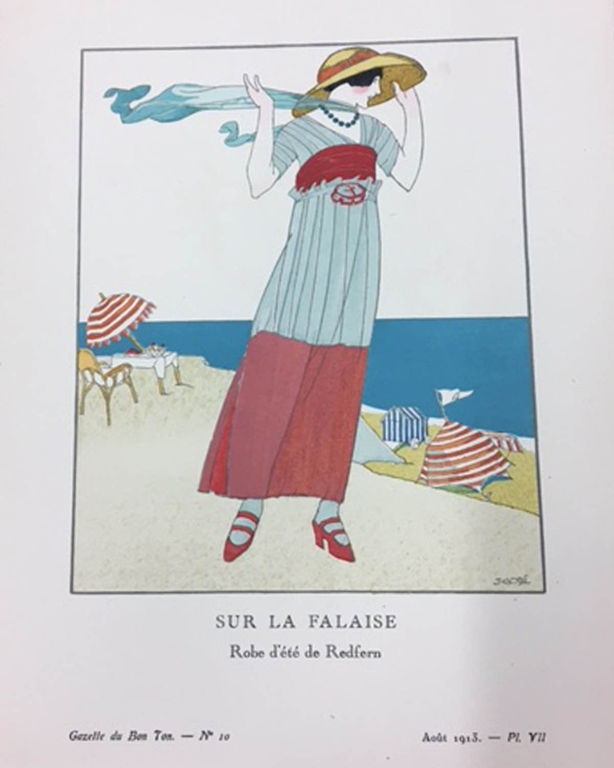
Spanish Illustrator Francesco Javier Gose, who was living in Paris at the time, (artistsandart.org) is the artist behind this featured fashion plate “Sur La Falaise” from the Gazette’s August 1913 edition. The image featuring a breezy summer frock by less widely known but significant couture house John Redfern and Sons (North 145) imbues the leisurely active yet elegant lifestyle of the French elite that was so desirable then and now. Known primarily for his British business of “tailor-mades” worthy of the Queen in the late 19th century (North 146), Redfern had now expanded to Paris and was located on the Rue de Rivoli. The house was considered “the rendez-vous of all the sportswomen whom the foreign and Parisian aristocracy count among their number” (David 249-251). The aesthetic of this floaty dress seems out of place amongst Redfern and Sons’ tailored riding suit looks from the decade prior, which attests to how drastic the shift in silhouettes and garment structure really was at this time.

The pochoir prints of the Gazette are incredibly beautiful in real life with their saturated colour and fine attention to detail that seem to have withstood the test of time as I observe them more than a century later. I am overwhelmed by their preeminence as fashion depiction. With the digital advances of recent decades we have become inundated with fashion imagery and messaging, so much so that very little seems as remarkable, or memorable as these precious morsels that were truly groundbreaking in their time. Still, the allure of this special place where fashion and art converge as equals, is not necessarily indebted to the aforementioned art technique, the highly evolved presence of the new look, or the avant-garde artistic approach of the illustrators alone, but can also be attributed to the signs and symbols projected by this “enormous combinatory freedom” (Baudrillard 89).
Considering the fashion journal’s layout and paper choices itself, it can be seen as a revival of French tradition and a disguise as “something antiquated” (Bidou qtd. In Davis 50). The fashion trends themselves also offer a feeling of déjà vu, a mimicking of the silhouettes worn by fashion elite a century before and also reminiscent of columnar draping and high waist ties seen in ancient Grecian dress. Jean Baudrillard makes great sense of this recycling in his work discussing fashion and the code whereby he describes “the enjoyment of fashion is therefore the enjoyment of a spectral and cyclical world of bygone forms endlessly revived as effective signs” (88). Perhaps the return to these classic forms particularly when embarking on war made fashion seem new while also comforted by the return of a classic look.
Embedded within this fashion plate is messaging promoting the idealized lifestyle of privileged Parisians. The beachscape with the elegant woman bracing the sandy cliff suggests a tony lifestyle of leisure and travel (Parisians would have to travel to reach this beach) that was desirable for those that could afford to partake. Sandy spots such as Deauville and Le Touquet are still considered exclusive beaches today. The washed red white and blue striped palette used in Gose’s illustration signals pride in France and validates the sophistication of French taste encapsulated by the Gazette that is still valued as a contemporary aesthetic today as seen here in a Spring 2018 piece by Sonya Rykiel.

My awareness of the subtle yet distinct ‘Frenchness’ of this Spaniard’s intentional palette with striping, (which is also a seaside symbol like the striped Mariniere sweaters that inspired the T-shirt above) makes an interesting case study of Barthes’ semiological explanation of the fashion system. Take for example the notion that many countries including England, France, and the United States, all adopted the same basic colours of red, white and blue, along with graphic striping for their country’s flag. Yet the traditional and contemporary use of each nation’s patriotic colours within their cultures exhibited here can be discerned as distinctly different. The subtle use of the French ‘blue white and red’ signified an “intense nationalism that then characterized French society” (Steele 192-213), while the far bolder American use of ‘the red white and blue’ for example, is also a curious phenomenon that can be decoded to explain fashion’s aim (Jobling 132). More on this interesting French colour use that “originated during the French Revolution and its representative values of liberté, égalité & fraternité” is detailed by Emmanuelle Dirix in her looking into the use in fashion as it relates to French Culture (49).
Take the two images below sporting the same patriotic colour palette, first the classic netted French market bag (see Fig. 5) which has been made by the same manufacturer since 1860 (makokids.com), and in contrast the American pride bikini by Beach Joy (see Fig. 6) featuring the combination of the red white and blue in flag-form. The vegetable bag in its simplicity is devoid of luxurious materials yet conjures up high fashion, while the bikini already laden with the sexual appeal in the expectation of fashion’s body reveal, reads less about fashion and more about pop culture. Different I suggest is the use of the same shades of colour, the French utilizing a subtlety of colour and symbolism, while American design taking a bolder approach to colour and patriotic patterning. The strong connotation of France’s sophistication and elegance seems to be wrapped up in the striped vegetable bag as equally as in Redfern’s chic frock back in 1913. This “binary logic is the essence of modernity” (Baudrillard 90) and of fashion too it seems. I am curious to know how others might interpret the use and effect of these colours in French fashion vs. America or British as signifiers of fashion?


Efrat Tseelon’s work aligns Baudrillard’s orders of simulacra to the nature of signification and reports that the modern era for which Sur La Falaise was a part, is based on Baudrillard’s production order of simulacra whereby the image itself has started to blur with the use of illusion and is seen as an ‘indirect signifier’ still linked to the signified (221). Both Baudrillard’s stages and Tseelon’s alignment are well supported by the fact that for the first time during the start of the twentieth century the Gazette initiated and celebrated the artists’ ability to embellish and co-create what fashion was, even going so far to have three out of the ten fashion plates to entail design creations of the artists alone. This blurring and embellishment of what was real did not detract from the images’ ability to clearly and concisely communicate the cultural signs of what was au courant, rather it acted to enhance this messaging.
I savour these images, the journal, and the fashion moments they represent. The period before the Great War was an exciting time of social and stylistic change that I see as a birthplace of today’s fashion marketing. The new direction taken by the Gazette and the associated illustrators and designers concedes to slightly altered view of reality, yet in my opinion is foundational to fashion itself. In its infancy, this fashion movement maintains a precious and innocent quality, still devoid of the over-saturation and simulation that later overtakes society in post-modern times which Baudrillard so effectively argues is the final order of simulacra (Tseelon 218). Gose’s background scenery is powerful, alluding to the desired cultural standard for elegance and luxury of this time and place. His soft use of the nation’s colours makes a nonchalant statement of nationalistic pride and good taste, that I suggest are characteristic of French fashion and are still desirable and discernible today, which is not bad for a Spanish Illustrator and a British Designer :).
Works Cited
Baudrillard, Jean. “Fashion, or the Enchanting Spectacle of the Code.”Symbolic Exchange and Death. Sage, 1993, pp. 87-99.
“Blog of an Art Admirer” artistandart.org, www.artistsandart.org/2009/10/francisco-javier-gose-1876-1915.html. Web. 31 Mar. 2018.
David, Alison Matthews. “Equestrian Costume.” The Berg Companion to Fashion. Ed. Valerie Steele. Oxford: Bloomsbury Academic, 2010. Bloomsbury Fashion Central. Web. 01 Apr. 2018. www-bloomsburyfashioncentral-com.ezproxy.lib.ryerson.ca/products/berg-fashion-library/encyclopedia/the-berg-companion-to-fashion/equestrian-costume.
Davis, Mary E. Classic Chic: Music, Fashion, and Modernism. University of California Press, 2008, pp. 48-92.
Dirix, Emmanuelle.” Contradictory Colors: Tricolor in Vich France’s Fashion Culture”. Colors in Fashion. Faiers, Jonathan and Mary Westerman Bulgarella. Bloomsbury Academic, 2017. EBSCOhost, ezproxy.lib.ryerson.ca/login?url=http://search.ebscohost.com/login.aspx?direct=true&db=nlebk&AN=1355780&site=ehost-live. pp. 47-56.
Jobling, Paul. “Roland Barthes Semiology and the Rhetorical Codes of Fashion.” Thinking Through Fashion: A Guide to Key Theorists. Edited by Agnes Rocamora and Anneke Smelik, 2016, pp. 132-148.
“Mabo” Mabokids.com, www.mabokids.com/products/filt-small-bag-red-white-and-blue Web. 31 Mar. 2018.
North, Susan. “John Redfern and Sons, 1847 to 1892.” Costume, no. 42, 2008, pp. 145-168
Steele, Valerie. “Into the Twentieth Century.” Paris Fashion: A Cultural History. London: Bloomsbury Visual Arts, 2017. 192-213. Bloosbury Fashion Central. Web 01 Apr. 2018. <http://dx.doi.org.ezproxy.lib.ryerson.ca/10.5040/9781474269711.ch-011>.
Tseelon, Elfrat. “Jean Baudrillard Post-modern Fashion as the End of Meaning.” Thinking Through Fashion: A Guide to Key Theorists. Ed. Agnes Rocamora and Anneke Smelik, 2016, pp. 215-232.
I really enjoyed reading this piece as it draws attention to a form of aesthetic we are somehow attuned to and yet, can’t really express why. Subsequently, that is exactly what you have done really well through your research and engagement with both primary and secondary sources. You have in fact, created an informative and pleasant dialogue between existing nuances in taste and aesthetics. Ultimately, I agree with your overall distinction–in other words, where the French market bag is perceived as chic, the American bikini could be seen as kitsch. Adding to that, I personally feel that, almost anyone–French or not–would sport the bag, whereas, the bikini is quite bold in its reference to American patriotism and frankly, one that I would never wear myself.